Blog
Design is Everything in Specialty Coffee
Good, considered design matters more in specialty coffee than in almost any industry. Here’s a few of our thoughts on why.
By Raymond Brigleb
Design is Everything in Specialty Coffee
Good, considered design matters more in specialty coffee than in almost any industry. Here’s a few of our thoughts on why.
By Raymond Brigleb
Your Website Is Feeding Robots a Five-Course Meal (When All They Want Is a Sandwich)
If you’ve noticed odd traffic patterns, or your site feeling sluggish at odd hours when nobody’s actually browsing it, you’re not imagining things. Something changed over the past year, and it’s affecting almost every site we manage.
By Raymond Brigleb
Your Website Is Feeding Robots a Five-Course Meal (When All They Want Is a Sandwich)
By Raymond Brigleb, February 18, 2026
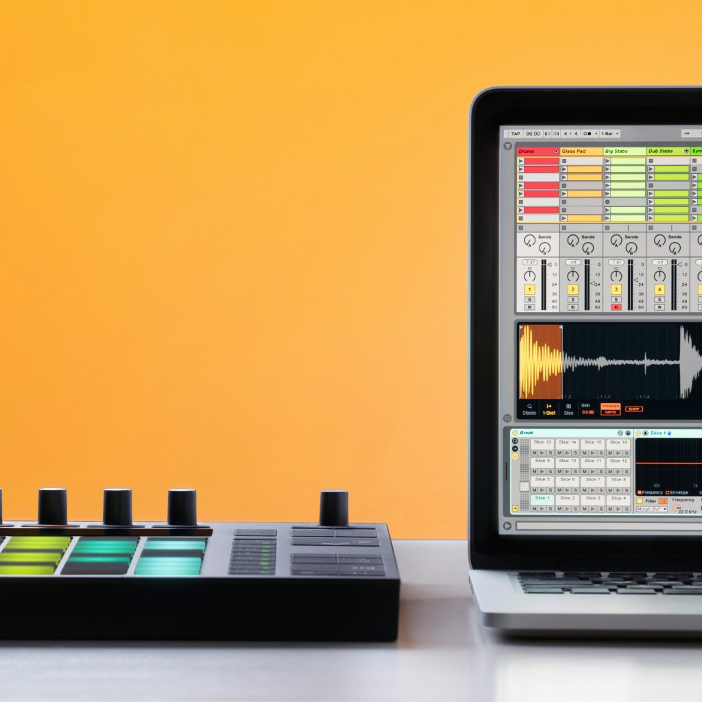
Why Ableton Is Thriving While Native Instruments Is Falling Apart
When you can spot whether a company is playing the long game or the short one, you know who deserves your business.
By Raymond Brigleb
Why Ableton Is Thriving While Native Instruments Is Falling Apart
By Raymond Brigleb, February 5, 2026
My Terminal Image Problem
Thanks to lots of weird innovations, the command line has become fun again.
By Raymond Brigleb
My Terminal Image Problem
By Raymond Brigleb, January 24, 2026
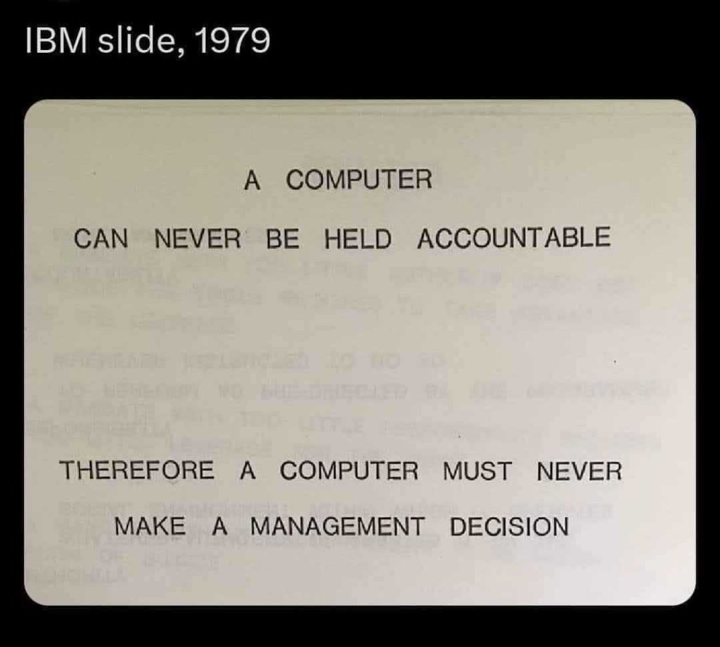
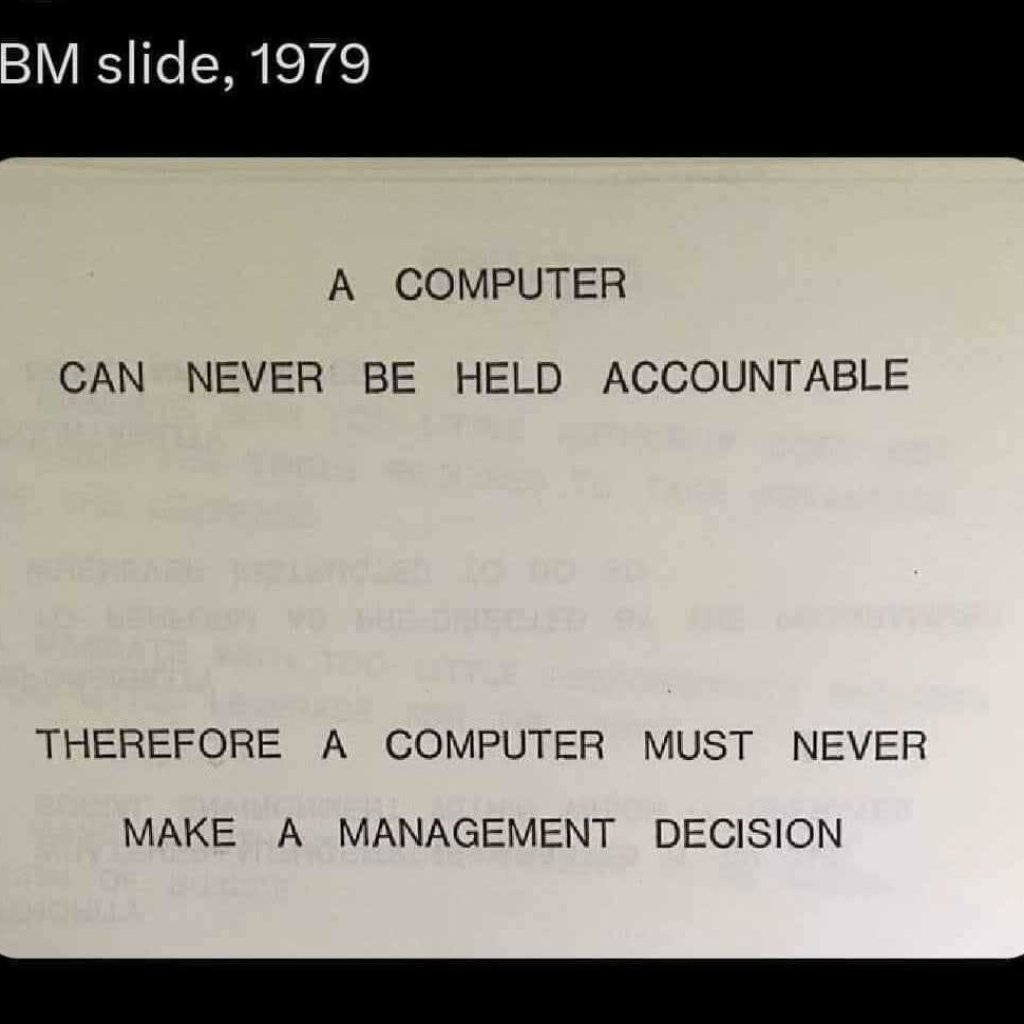
AI Can’t Say No
When faced with a set of choices, I almost always feel that an AI will make the wrong call. I have a theory.
By Raymond Brigleb
AI Can’t Say No
By Raymond Brigleb, January 16, 2026
Accessibility and New Hero
Some of our new favorite fonts include special designs to improve accessibility.
By Raymond Brigleb
Accessibility and New Hero
By Raymond Brigleb, January 6, 2026
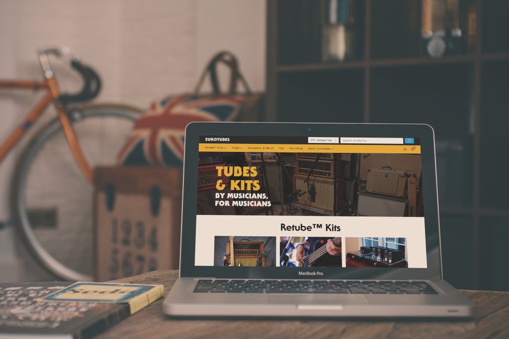
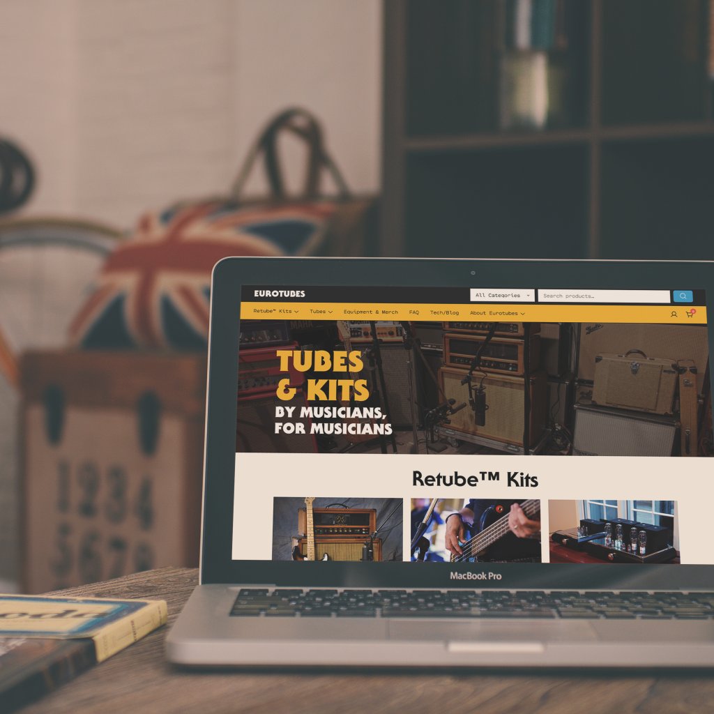
Checking in with Eurotubes
Sometimes the best transformations happen quietly, measured not in launch day metrics but in the daily relief of problems finally solved.
By Kandace Brigleb
Checking in with Eurotubes
By Kandace Brigleb, December 1, 2025
Introducing bc4: A Command Line Interface for Basecamp
We’ve just open-sourced a command line tool for working with Basecamp.
By Raymond Brigleb
Introducing bc4: A Command Line Interface for Basecamp
By Raymond Brigleb, July 22, 2025
A 14-Year WooCommerce Journey From Day One to Pro Partner
From early adopter to keynote speaker to Pro Partner—our journey with WooCommerce spans the platform's entire history. After 14 years of crafting e-commerce experiences for coffee roasters, specialty food brands, and mission-driven companies, we've achieved WooCommerce's highest recognition. Here's how we got here and where we're headed next.
By Kandace Brigleb
A 14-Year WooCommerce Journey From Day One to Pro Partner
By Kandace Brigleb, July 15, 2025
Five Things I Learned Building a Coffee Tasting App (Again)
Rebuilding our 15-year-old coffee tasting app revealed how dramatically home brewing culture had evolved while we were designing for coffee businesses, teaching us valuable lessons in the process.
By Raymond Brigleb
Five Things I Learned Building a Coffee Tasting App (Again)
By Raymond Brigleb, July 4, 2025
The Patagonia Principle: Building Websites That Last a Decade (or More)
Ten years ago, we promised clients websites that would last a decade. Here's how we delivered on that promise, and the valuable lessons we learned about digital sustainability along the way.
By Raymond Brigleb
The Patagonia Principle: Building Websites That Last a Decade (or More)
By Raymond Brigleb, May 19, 2025
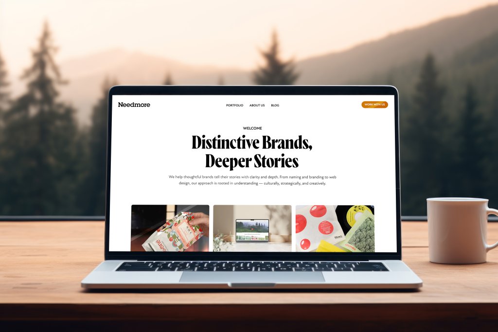
Moving Our Website to Craft CMS
After two decades on WordPress, we rebuilt our website from scratch with Craft CMS. The result? Lightning-fast pages, perfect Google scores, streamlined content management, and the joy of storytelling.
By Raymond Brigleb
Moving Our Website to Craft CMS
By Raymond Brigleb, May 12, 2025
Page 1 of 17
Next →


