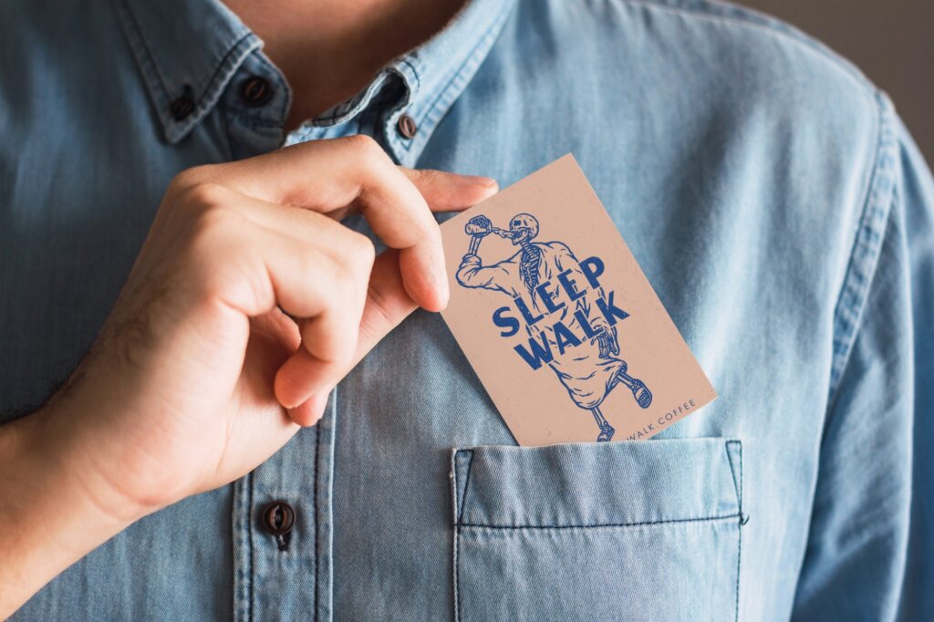
Person tucking business card into their pocket

Sleepwalk

Illustrating a Brand Between Dreams & Coffee

A pecu­liar alche­my hap­pens at the inter­sec­tion of slum­ber and con­scious­ness — that lim­i­nal space where real­i­ty bends and the mun­dane trans­forms into the extra­or­di­nary. This thresh­old state became our cre­ative well­spring when craft­ing the iden­ti­ty for Sleep­walk, a cof­fee and BBQ food truck nes­tled along­side a high-end motor­cy­cle shop in Belling­ham, Washington.

Visual Somnambulism: Where Vintage Meets Macabre

The Sleep­walk iden­ti­ty emerges as a play­ful dance between com­fort and the uncan­ny. Draw­ing from vin­tage cof­fee can lids and retro beer pack­ag­ing, we craft­ed a cir­cu­lar emblem that feels simul­ta­ne­ous­ly nos­tal­gic and con­tem­po­rary — a visu­al time cap­sule with mod­ern sen­si­bil­i­ties. The mint-green back­drop (Fringy Flower) cre­ates a dreamy foun­da­tion, while the Night Blue typog­ra­phy anchors the iden­ti­ty with unex­pect­ed sub­stance and depth.

What makes this brand unique­ly com­pelling is its unex­pect­ed jux­ta­po­si­tion of the com­fort­ing and the macabre. A skele­ton in a teal bathrobe sip­ping cof­fee becomes the per­fect embod­i­ment of Sleep­walk’s para­dox­i­cal appeal — find­ing joy in that hazy state between con­scious­ness and uncon­scious­ness, between the liv­ing and the spectral.

Chromatic Consciousness: A Palette Between Worlds

The Sleep­walk col­or sys­tem func­tions as a sen­so­ry bridge between con­trast­ing states. The pri­ma­ry palette pairs author­i­ta­tive Night Blue with foun­da­tion­al Black, cre­at­ing a struc­tur­al frame­work that sup­ports the more ethe­re­al accent col­ors. Sum­mer Apri­cot — a gen­tle peach tone — estab­lish­es the brand’s dreamy atmos­phere, while Coconut Cream pro­vides warmth and breath­ing space. Fringy Flower and Foun­tain Blue com­plete the sys­tem, offer­ing ver­dant mint tones that con­nect the iden­ti­ty to both the restora­tive pow­er of cof­fee and the med­i­ta­tive state of half-slumber.

These aren’t mere­ly col­ors on a spec­trum but emo­tion­al way­points that guide cus­tomers through Sleep­walk’s unique expe­ri­en­tial jour­ney — from the lan­guid com­fort of awak­en­ing to the sharp pres­ence that comes with the first sip of per­fect­ly craft­ed coffee.

Typographic Reverie: A Duo-Voice Narrative

The typo­graph­ic archi­tec­ture cre­ates a har­mo­nious sys­tem despite its delib­er­ate quirk­i­ness. Carters Reg­u­lar forms the foun­da­tion of the Sleep­walk logo, its dis­tinc­tive per­son­al­i­ty imme­di­ate­ly rec­og­niz­able even at a dis­tance. Brewis­ten Reg­u­lar intro­duces a com­ple­men­tary eccen­tric­i­ty for head­ings and accent moments.

This typo­graph­ic trin­i­ty does­n’t mere­ly com­mu­ni­cate — it con­vers­es, cre­at­ing a visu­al dia­logue between slum­ber and wake­ful­ness, between the famil­iar and the strange, between vin­tage com­fort and con­tem­po­rary edge.

Illustrated Dreams: Characters From the In-Between

The char­ac­ter illus­tra­tions form the emo­tion­al heart of the Sleep­walk iden­ti­ty. The pri­ma­ry skele­ton fig­ure — caught in a per­pet­u­al state of com­fort­able drowsi­ness yet ener­gized by cof­fee — embod­ies the brand’s core promise. Mean­while, the skull nes­tled in grass and the repeat­ing slip­per motif expand the visu­al vocab­u­lary, cre­at­ing a rich nar­ra­tive ecosys­tem that can adapt across var­i­ous touchpoints.

These illus­trat­ed ele­ments trans­form from mere dec­o­ra­tion to pow­er­ful brand sig­ni­fiers, each car­ry­ing the dis­tinc­tive Sleep­walk sen­si­bil­i­ty — slight­ly macabre yet unde­ni­ably charm­ing, famil­iar yet unexpected.

Verbal Incantations: Words That Wake and Wander

The mes­sag­ing sys­tem com­plet­ed the sen­so­ry expe­ri­ence with ver­bal touch­points that echo the brand’s play­ful dual­i­ty. Phras­es like Good Day!” and Up Your Morn­ing Game” are ren­dered in Night Blue against Sum­mer Apri­cot back­grounds, while the pair­ing of Cof­fee Worth Walk­ing For” with the skele­ton mas­cot cre­ates moments of delight­ful visu­al sto­ry­telling. These ver­bal-visu­al com­bi­na­tions func­tion as mini bill­boards, instant­ly com­mu­ni­cat­ing the brand’s unique per­spec­tive and promise.

Good Day on a tote bag

From Slumber to Savor: The Complete Experience

The com­plete Sleep­walk iden­ti­ty sys­tem tran­scends its indi­vid­ual com­po­nents to cre­ate some­thing greater — a cohe­sive sen­so­ry expe­ri­ence that trans­forms a road­side stop into a mem­o­rable des­ti­na­tion. Through thought­ful design archae­ol­o­gy and play­ful sto­ry­telling, we’ve craft­ed not just a brand but a state of mind — one that cel­e­brates that deli­cious, drowsy state between sleep and wake­ful­ness and trans­forms it into some­thing not just sell­able but gen­uine­ly magnetic.

In the crowd­ed land­scape of cof­fee and food truck con­cepts, Sleep­walk stands apart — not through over­whelm­ing visu­al noise but through the qui­et con­fi­dence of know­ing exact­ly what it is: a delight­ful para­dox, a wak­ing dream, and ulti­mate­ly, a place where good cof­fee and great BBQ turn an ordi­nary day into some­thing just a lit­tle bit extraordinary.

Person tucking business card into their pocket
Sleepwalk logo on a camp mug

You Have a Sto­ry Worth Telling

Contact Needmore