Guilder
Crafting Distinctive Visual Character Through Story-Driven Design
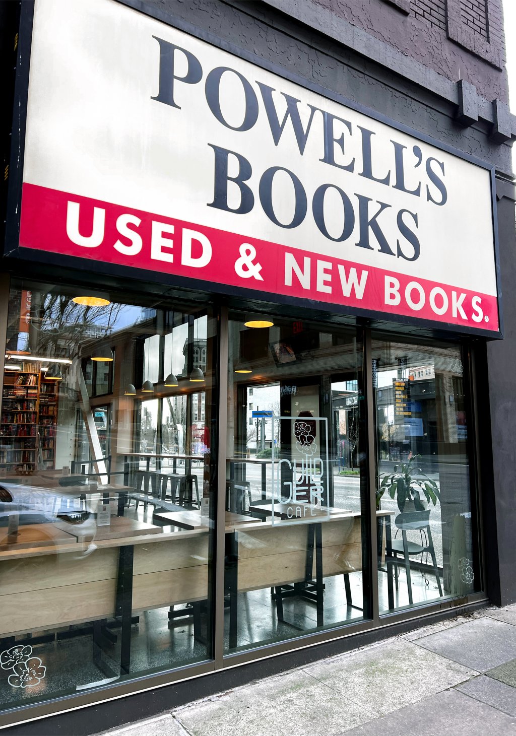
Portland’s beloved Princess Bride-themed café unfolds a new visual chapter with its not-so-inconceivable second location in the historic Powell's Books. It’s a narrative convergence where literary whimsy and specialty coffee craftsmanship intertwine.
Services
Client
Guilder

A Tale of Typography and True Love
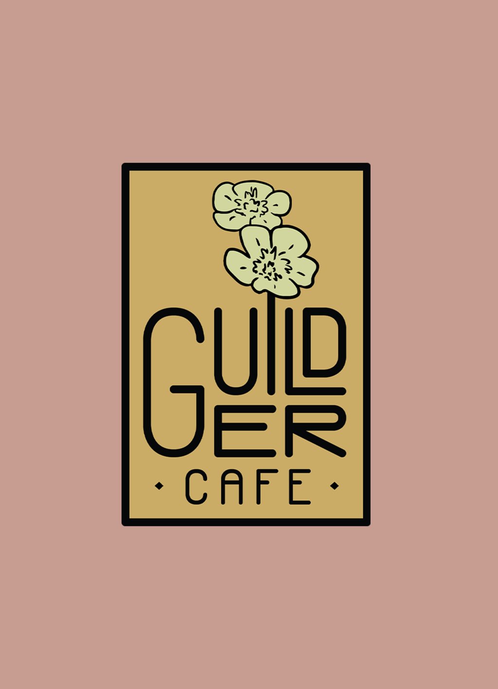
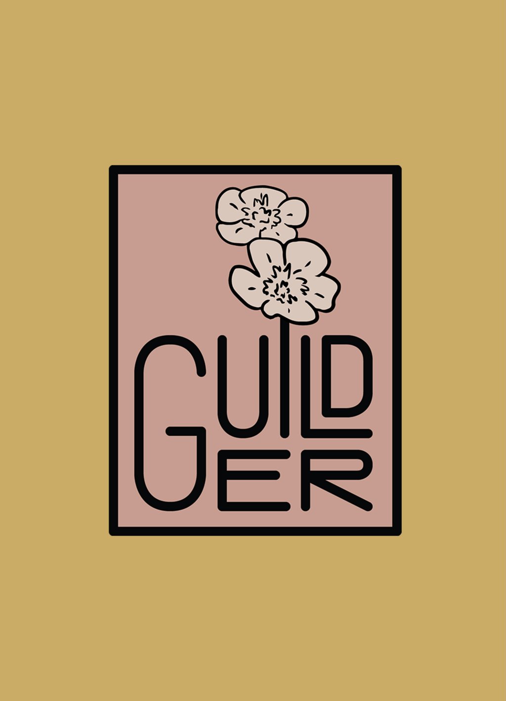
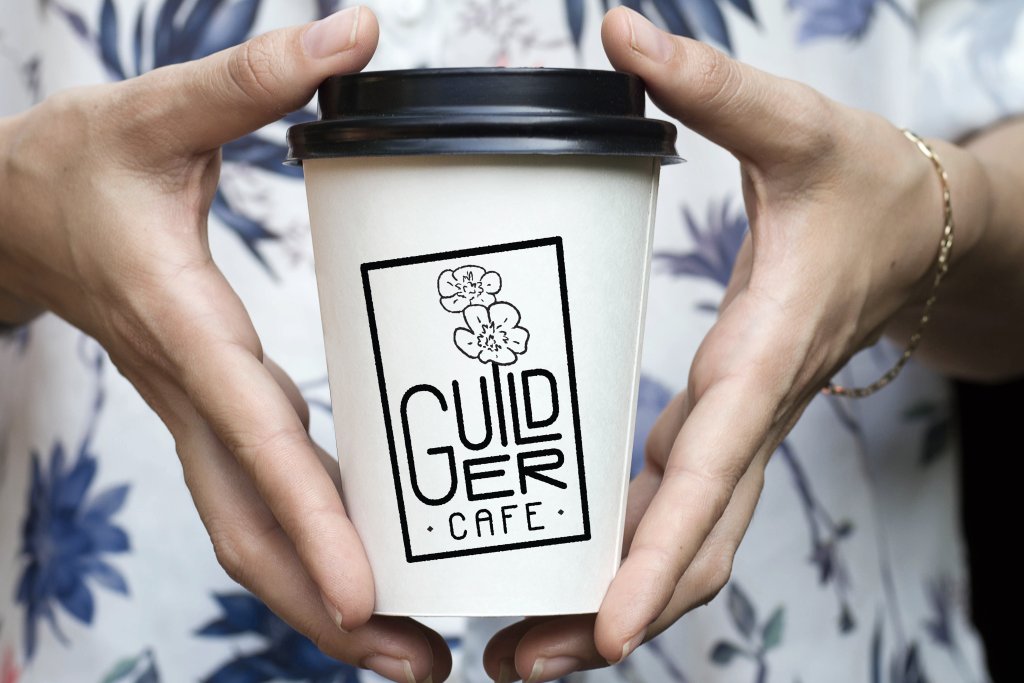
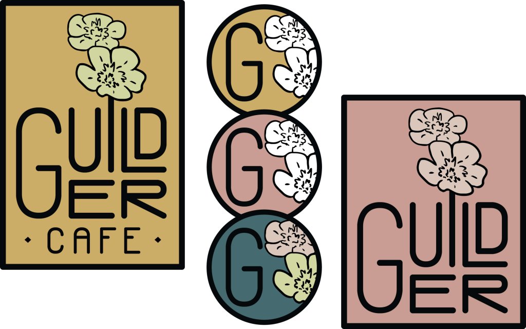
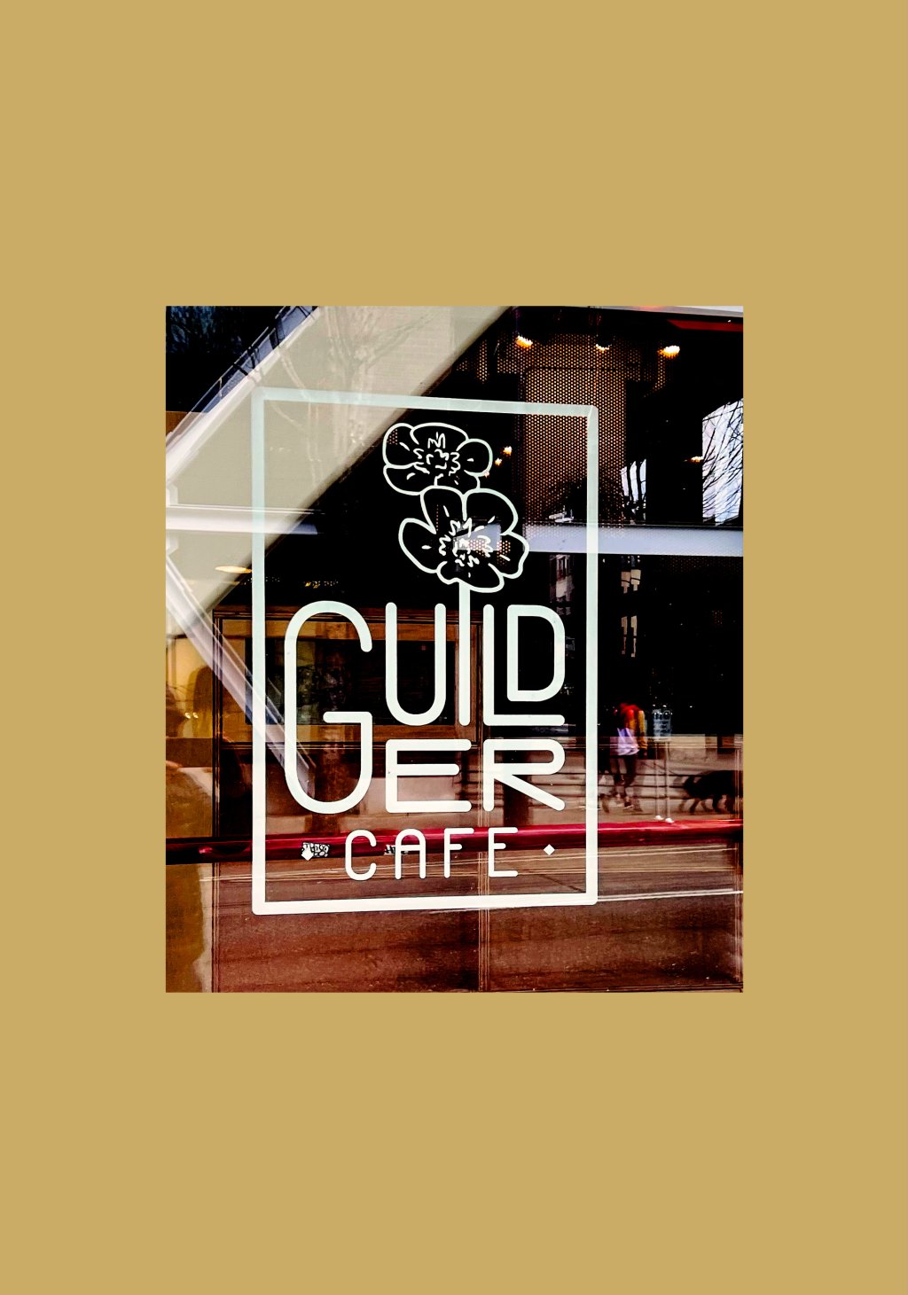
The Guilder story begins with letters that stand boldly on their own yet become part of something greater when fit together, much like the unlikely heroes in The Princess Bride who form an unforgettable ensemble. The custom typography in the logo creates a distinctive visual voice that speaks with the confidence of Inigo Montoya and the charm of Westley. Each character in the logotype stands with purpose, creating a lockup that frames the café experience like a window into another world. Or perhaps like looking at a beloved book about to reveal its next chapter.
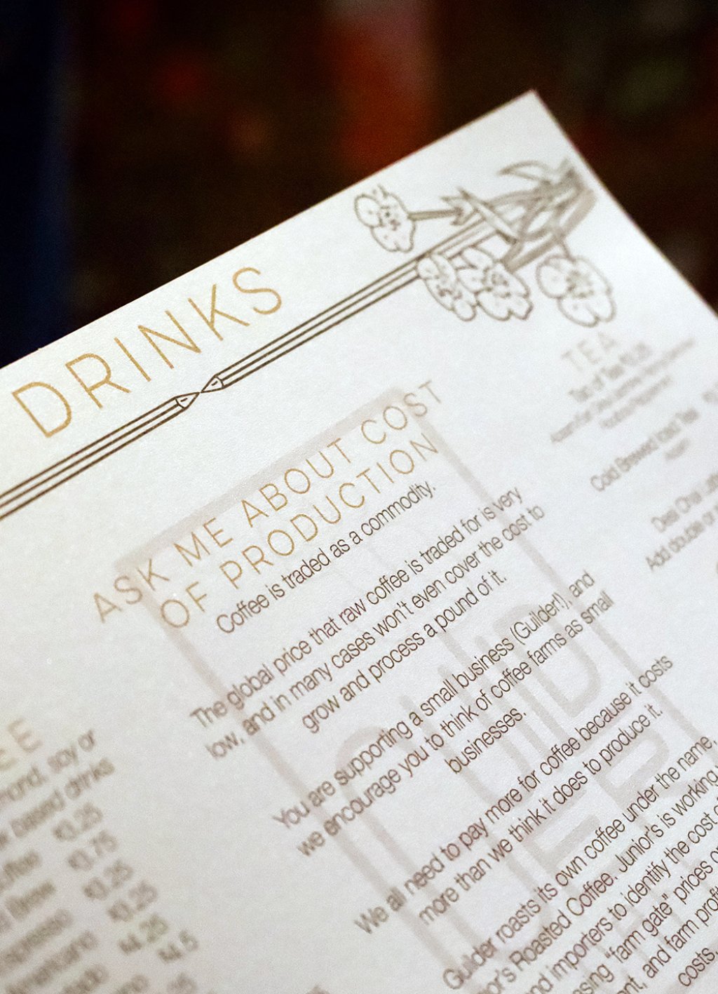
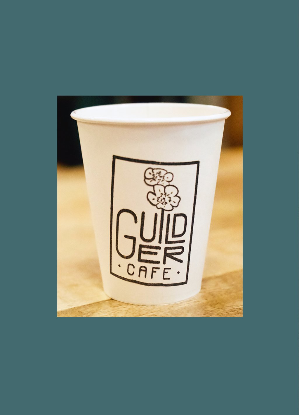
We love the new branding for Guilder and Guilder Cafe! Whenever I see it in print or digital, it makes me smile.

The Colors of Two Kingdoms
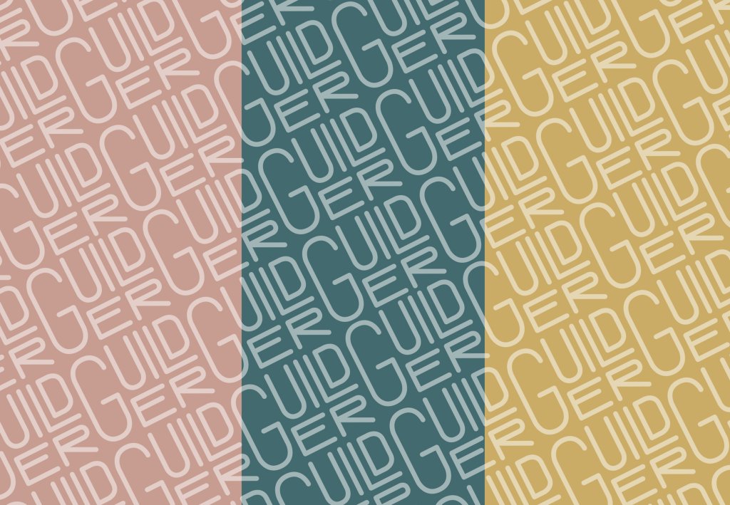
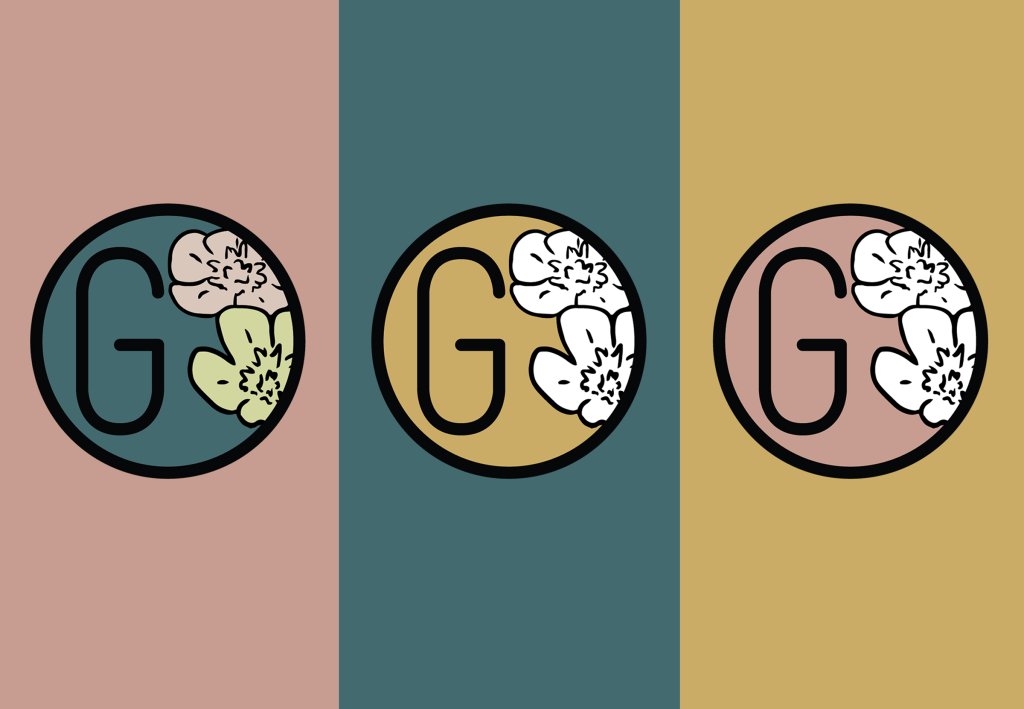
Just as The Princess Bride traverses multiple landscapes, Guilder’s visual identity adapts to its two distinctive realms while maintaining a cohesive narrative. The original Northeast Portland location embraces warm pinks—hues that evoke the romance and intimacy of the story’s core love tale. The Powell’s Books location adopts a complementary yet distinct palette with golds—colors that conjure the weathered pages of beloved books and the golden glow of adventure that Powell’s patrons seek between the covers.
These colors don’t battle like the kingdoms of Florin and Guilder but instead create a harmonious visual alliance that would make even sworn enemies find common ground. Anchoring both color systems is an earthy brown serving as the primary text color and creating visual stability across all branded materials.
Illustrating the Adventure
The Guilder identity comes alive through illustrations as charming as the tale they reference. Buttercup flowers (a dual nod to the film’s heroine and Oregon’s native flora) and the distinctive sword of Inigo Montoya create visual touchpoints throughout the branded experience. These illustrations don’t merely decorate; they narrate, telling fragments of a story that customers are invited to piece together, much like the grandfather reading to his grandson in the film.
A Brand Story Without The Pit of Despair
The Guilder identity system demonstrates that themed experiences need not be heavy-handed or obvious. Instead, the visual elements don’t shout their Princess Bride connection—they whisper it, rewarding the observant and creating moments of delightful recognition for those familiar with the source material, while remaining accessible and engaging for those who simply appreciate thoughtful design. The brand creates a visual welcome that says, as Inigo might, “Hello! My name is Guilder Café. You need coffee. Prepare to drink.”
Whether experienced in the original café or within the storied walls of Powell’s Books, Guilder offers a visual journey that celebrates imagination, community, and craft—an identity system that, like The Princess Bride itself, achieves that rare balance of whimsy and sincerity, creating something that is, to borrow from the movie, “as real as the feelings you feel.”
