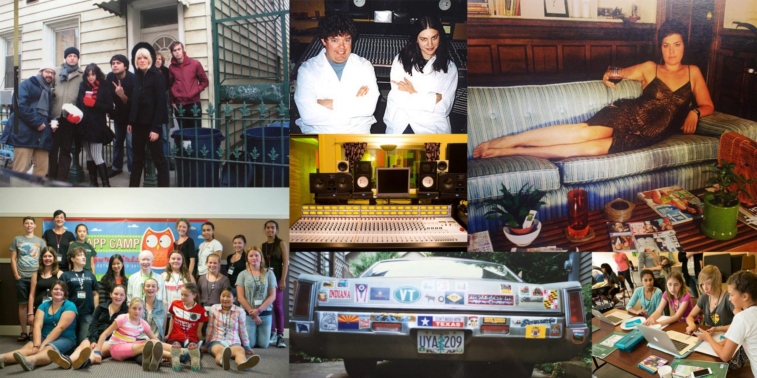

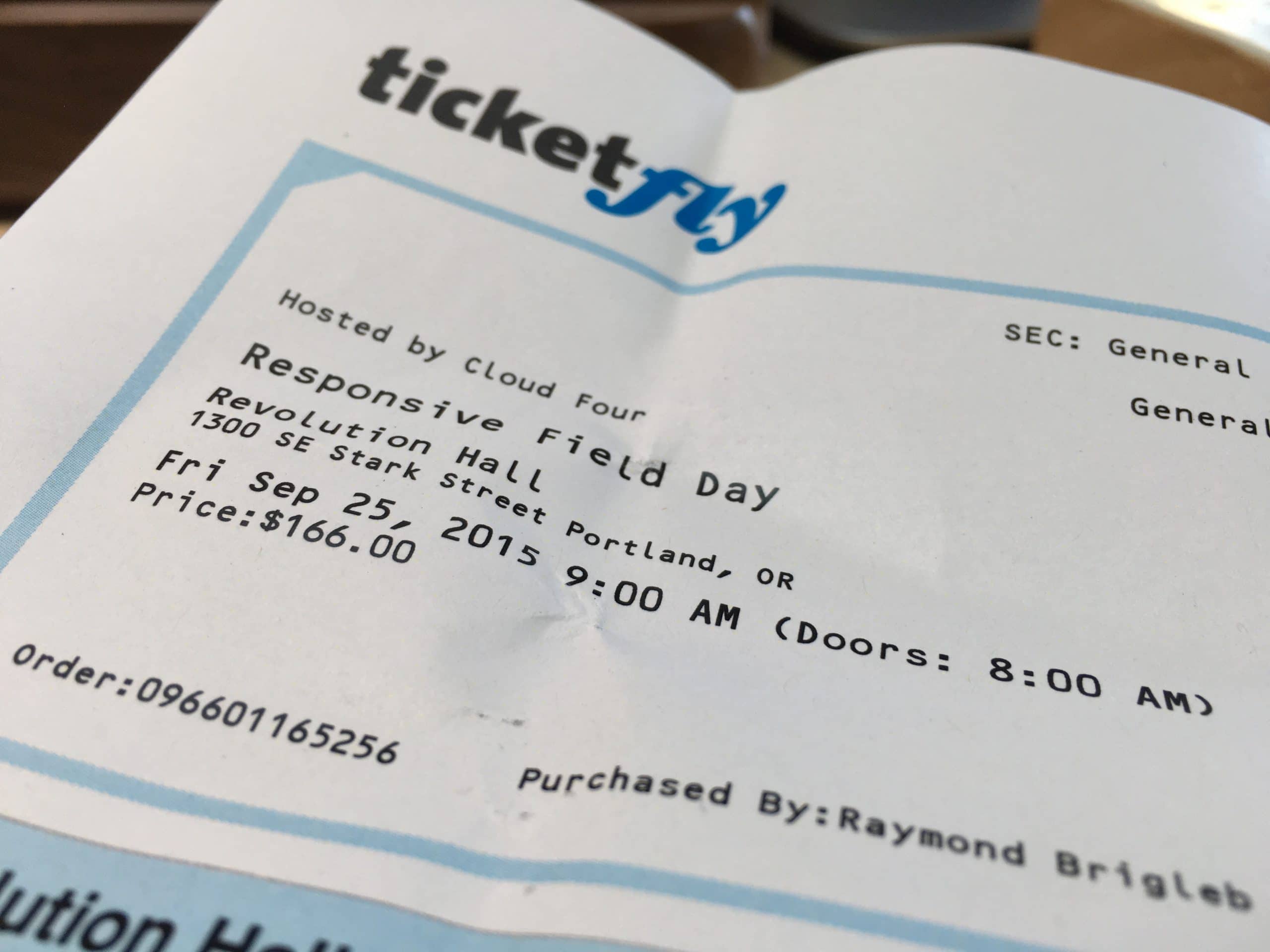
I’ll just let everyone’s notes from the fantastic Responsive Field Day speak for themselves…
Matt
Jeremy Keith’s talk really resonated with me. I heard at the conference that its inspiration was Jeremy’s event in Brighton, Responsive Day Out. He talked about “progressive enhancement” as a mindset in which you first build your website at the simplest, most basically functional level, using the simplest technology available. Once you have that in place, then you “enhance” it to be the full experience you’ve designed.
People access your website in a staggering variety of conditions, devices, and internet connections. Inevitably, some will be unable to get the full experience of your website because their browser is not up to snuff, or their wifi connection drops just as they are downloading your javascript, or any number of other reasons. Using Jeremy’s approach has the major benefit that those people are guaranteed to still have a website in front of them that has the core functionality you’re trying to deliver.
We practice something like this at Needmore Designs, and we call it the “layer cake.” The bottom layer is the HTML, the bare skeleton of the website. Only after we have built a website in HTML, with all of its most core functionality (pages and content exist, links exist to navigate around the site, images are there, etc.) do we move on to layers like styling and interactivity. It was great to hear Jeremy validate our approach, and to be reminded that sites built like this are backwards-compatible for just about any browser you care to name.
Kandace
Jen Simmons got me thinking about the possibility of visual design in her talk titled Modern Web Design: Getting Out of Our Ruts. As web designers, we often talk about design that looks as though it was “made for print.” This refers to design that doesn’t understand how the web works, that demands all kinds of acrobatics to look right on the desktop (and God help you on a phone).
The web has changed and new and exciting designs are possible. Jen talked about looking at magazine layouts and other print material for inspiration of the kids of layouts we could only dream of before in design (but are possible now). I loved the way she encouraged us to flip our perception of the web/print relationship while still grounding us in good old semantic mark-up.
Ray
My biggest take-away from this event was, to be honest, the idea that there are often no “right answers.”
For example, when approaching responsive design, folks will frequently advocate for starting with mobile first, then adding details as you get to larger display sizes. Of course, clients don’t generally respond to this, so you find yourself needing to focus on larger devices first after all, especially if that’s where your primary audience will be for the foreseeable future!
Or another example is making a “pattern library.” These are great ways to unify a design language, and invaluable for building a great project. But clients don’t really get this, and are not going to sign off on a pile of button and text styles in your first round! The solution? Do both at once. It sounds crazy, but it was ultimately agreed that this might be the right compromise for many projects.
Gritchelle

Melissa
The idea that resonated with me most was the concept of website performance budgeting with typefaces in mind. Many things can lag a website’s performance, from heavily weighted images to an abundance of animations and even choosing the wrong typefaces.
Yesenia Perez-Cruz of Vox Media spoke in-depth about this. One of the examples she gave was the redesign of a pizza site. This client chose a different typeface for each letter in their logo, when translating the new design to the web, she ran into the issue of exceeding the performance budget for type. Yesenia addressed the issue by setting a 100kb budget for type and gave the client a few options to choose from (a web font in three weights for body and heading, or three weights for the heading web font and use system fonts for body copy). She asked them of the options, which best translates their brand.
Exceeding a budget in one category will ultimately affect decisions in another. Therefore, creating a performance budget as a preemptive measure before a project takes off will save money and time. It’s important to continuously revert back to the budget throughout all design phases to keep the process in check.