Navigate the waters of beautiful coffee with your trusty captain, Royal Coffee.
With the energy and innovative spirit that one typically associates with emerging brands, it can come as a surprise that Royal Coffee has over 40 years of experience importing green coffee. In that time, their name has become synonymous with knowledge and trustworthiness. We partnered with Royal Coffee to rework their logo and digital presence with a keen eye on innovating over the next 40 years.

Brand Refresh
We embarked on an elegant logo refresh that retains the character and style of this iconic brand. Our challenge was to redesign their logo to be more elegant and readable on a variety of surfaces while retaining the original character and style.
One challenge of a legacy brand was the absence of original identity files. Little by little, we identified patterns in letters that could be used to clean-up the letterforms that had gotten distorted over time. This resulted in a more balanced and refined logo that has shape consistency throughout the letterforms.

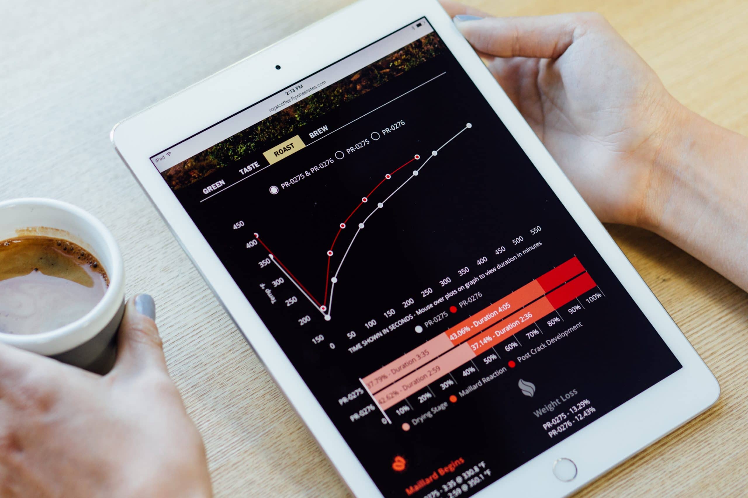
A Royal Web
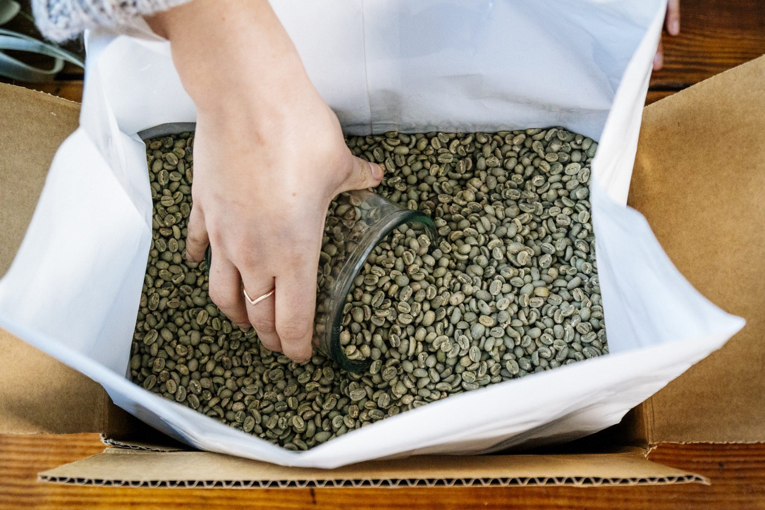
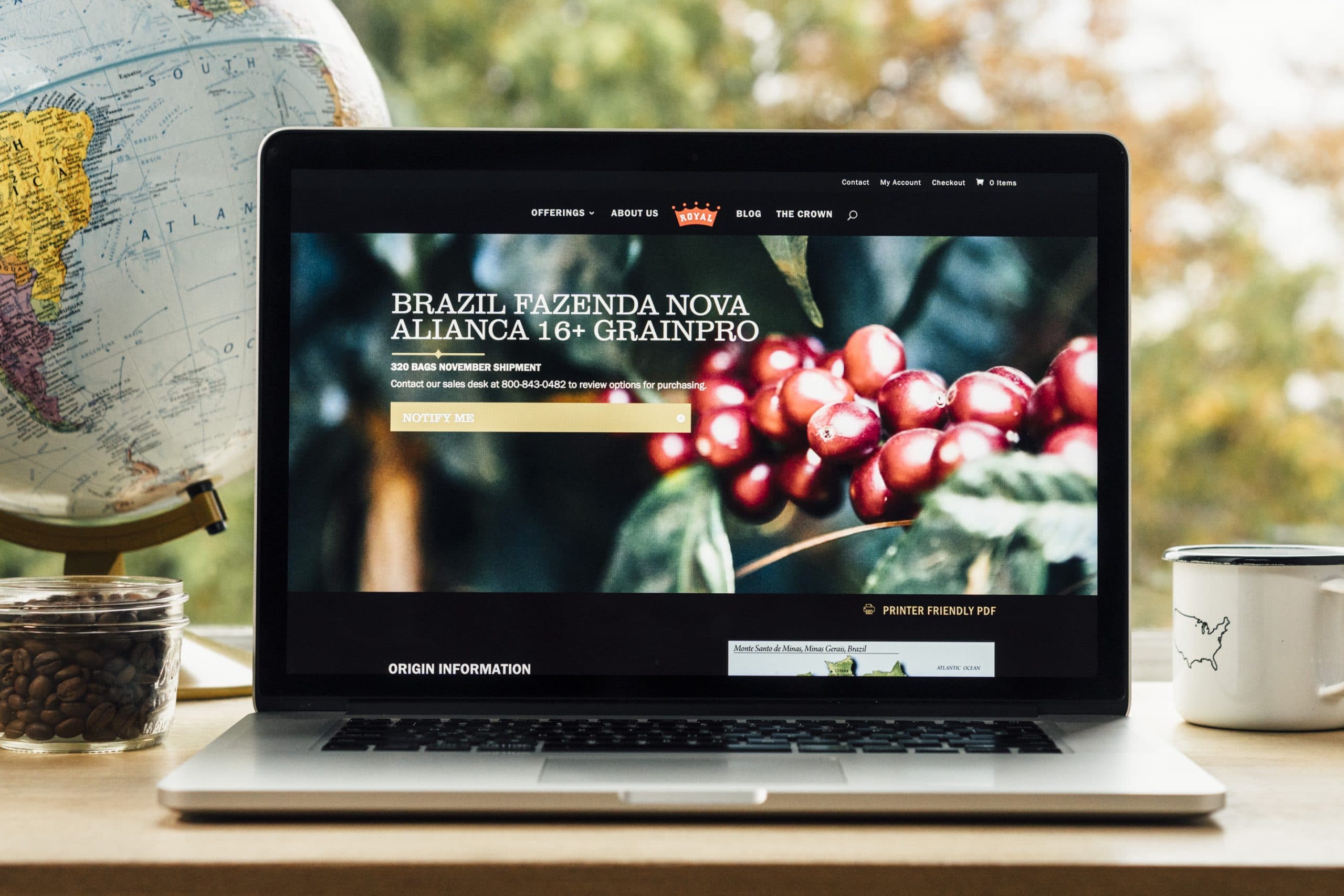
The team at Royal Coffee have a deep passion for coffee; their mission is to make coffee accessible to small and large roasters alike while also educating customers about coffee and coffee trends. We created a modern platform for searching and sorting through Offerings. One could easily spend an afternoon diving into Royal Coffee’s deep knowledge of individual coffees and trends.
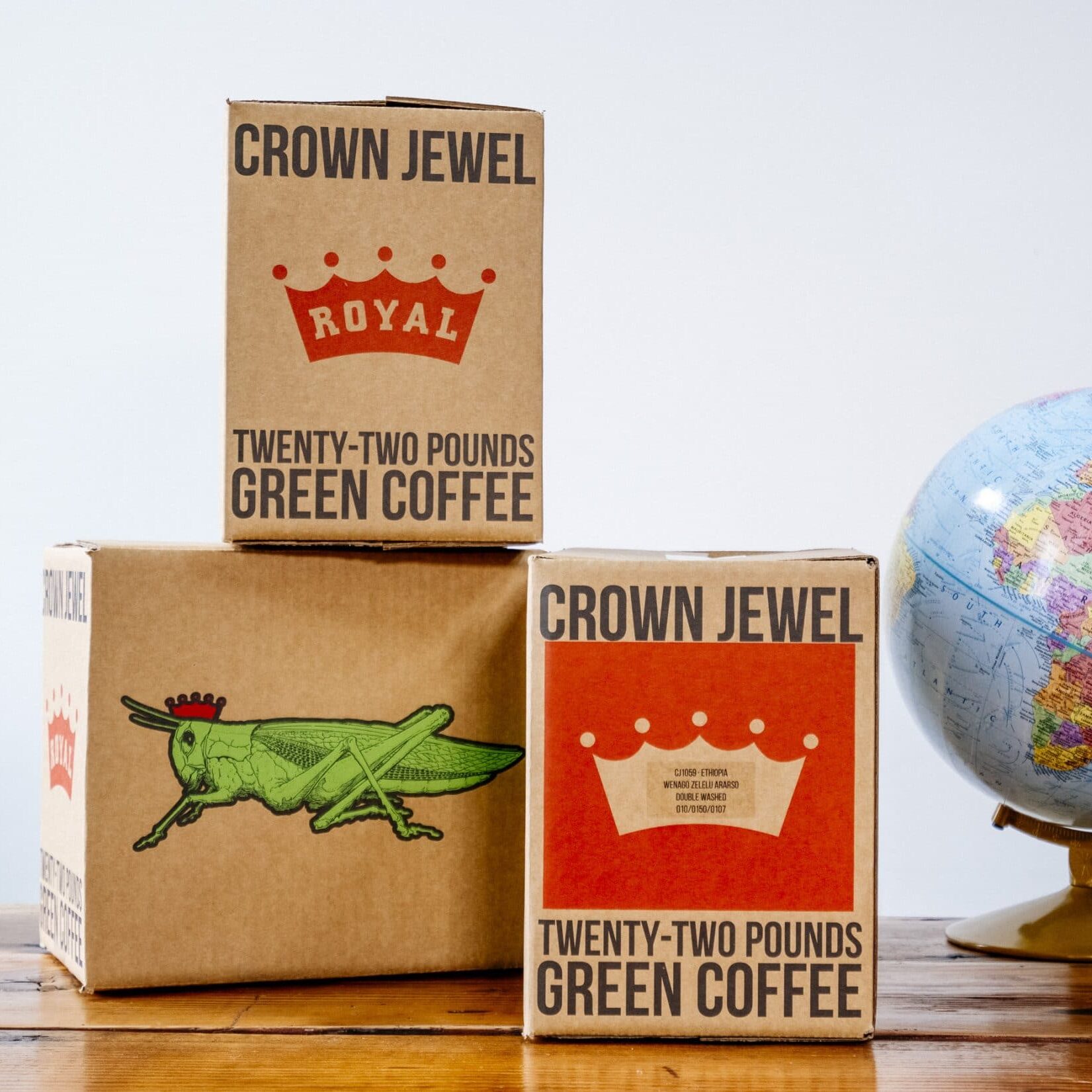
Whether it be their new Crown Jewel small box program or the opening of The Crown: Royal Coffee Lab & Tasting Room, this new digital platform lays the groundwork for an emerging era in Royal Coffee’s existence: that of industry leader.

“Needmore was one of the first people we called when we got serious about this project. We knew that in order to reflect the heart and soul of The Crown, we needed a digital representation and online platform where we could share our findings freely and widely.”