Joe Coffee Company
A Bold, Colorful Home for a New York Coffee Institution
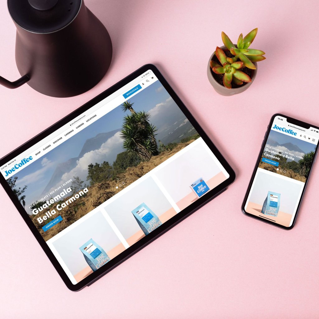
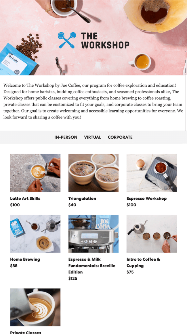
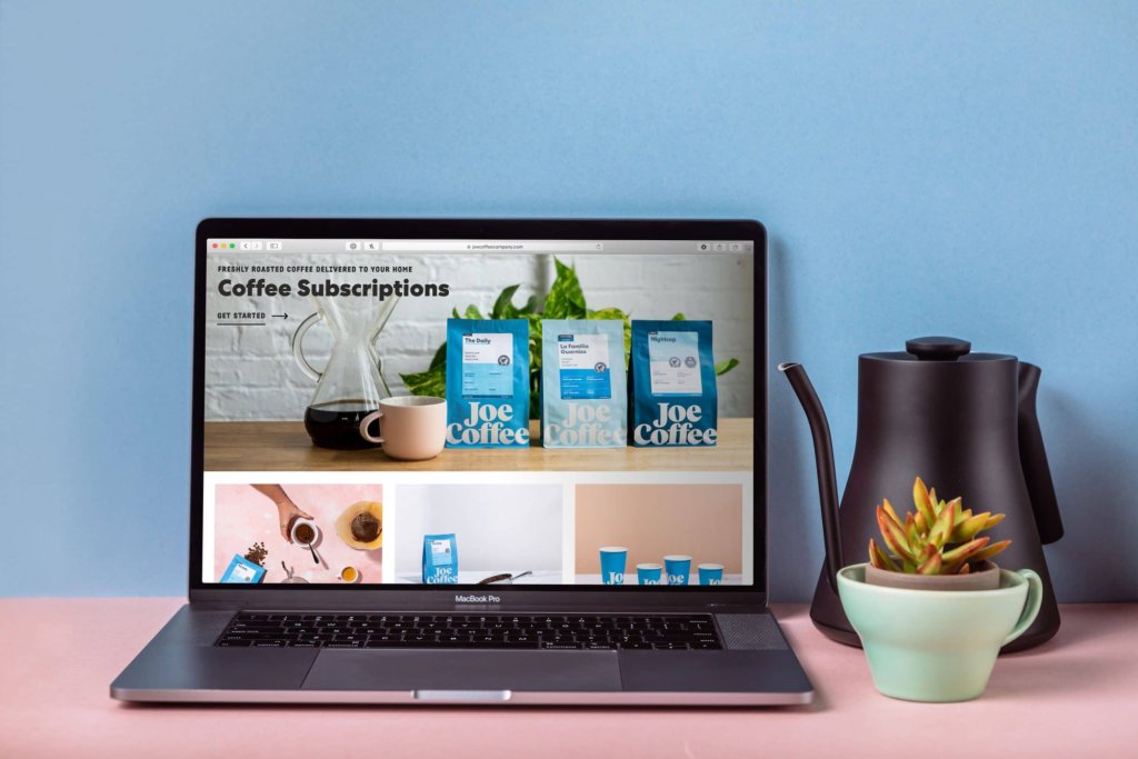
Joe Coffee has been part of New York since 2003. They’ve got cafés all over the city, a loyal following, and a brand that's unmistakably theirs — bold colors, confident typography, friendly without trying too hard. We built them a site that feels like walking into one of their shops. Warm, easy to navigate, and focused on the coffee.
Services
Client
Joe Coffee Company


The Design System
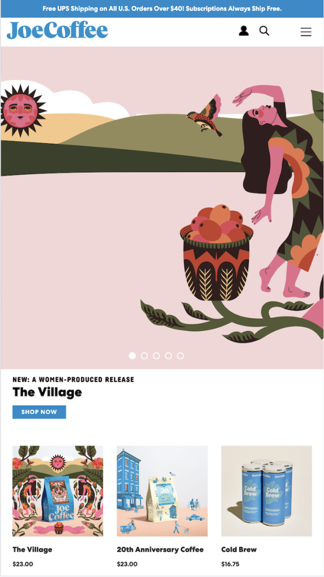
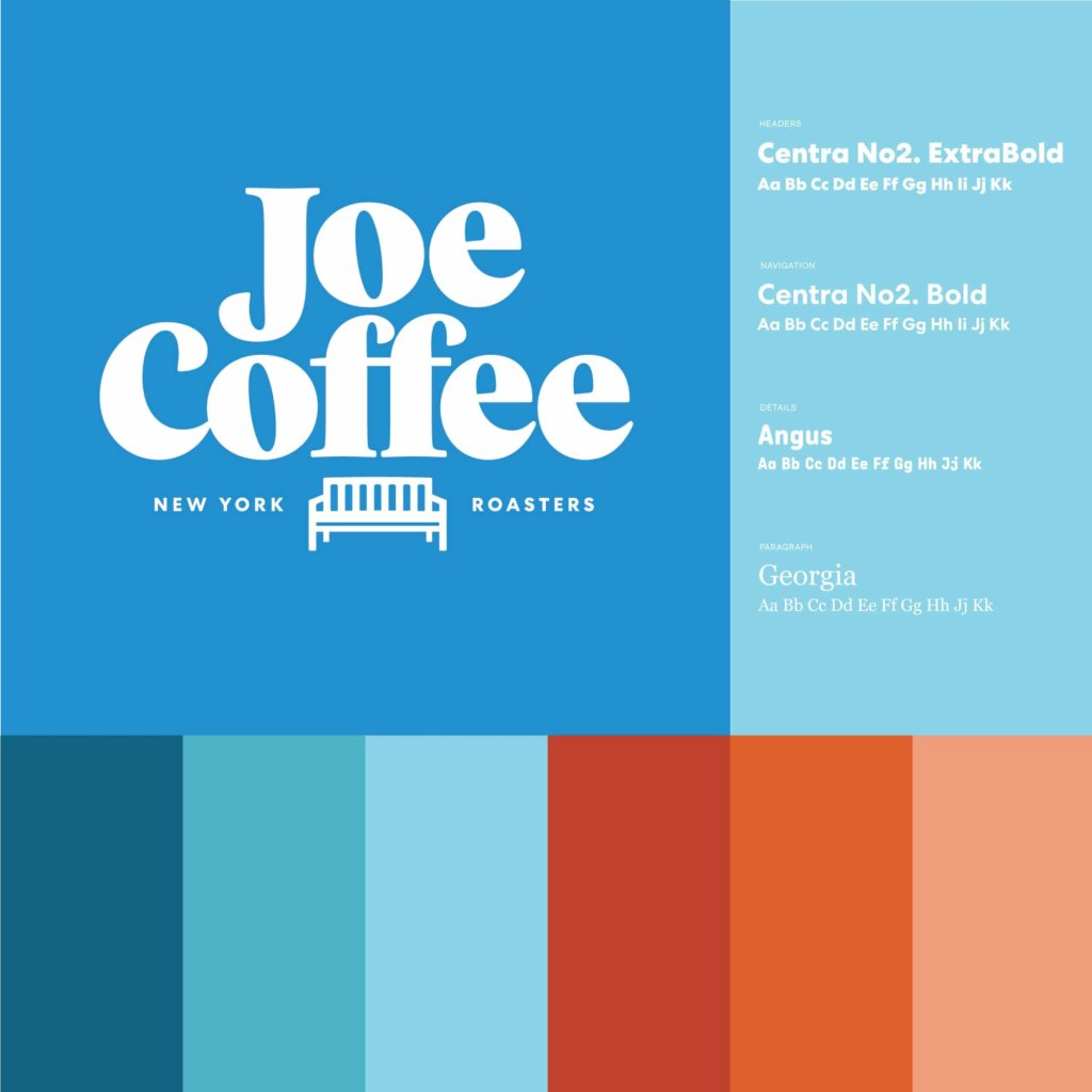
Joe’s visual identity sets the tone. The site picks up on those bold colors and that confident typography and carries them through every page. It’s distinctive in a crowded market without ever feeling like it's trying too hard.

Product Pages
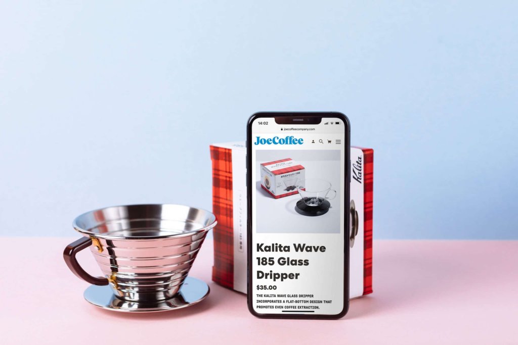
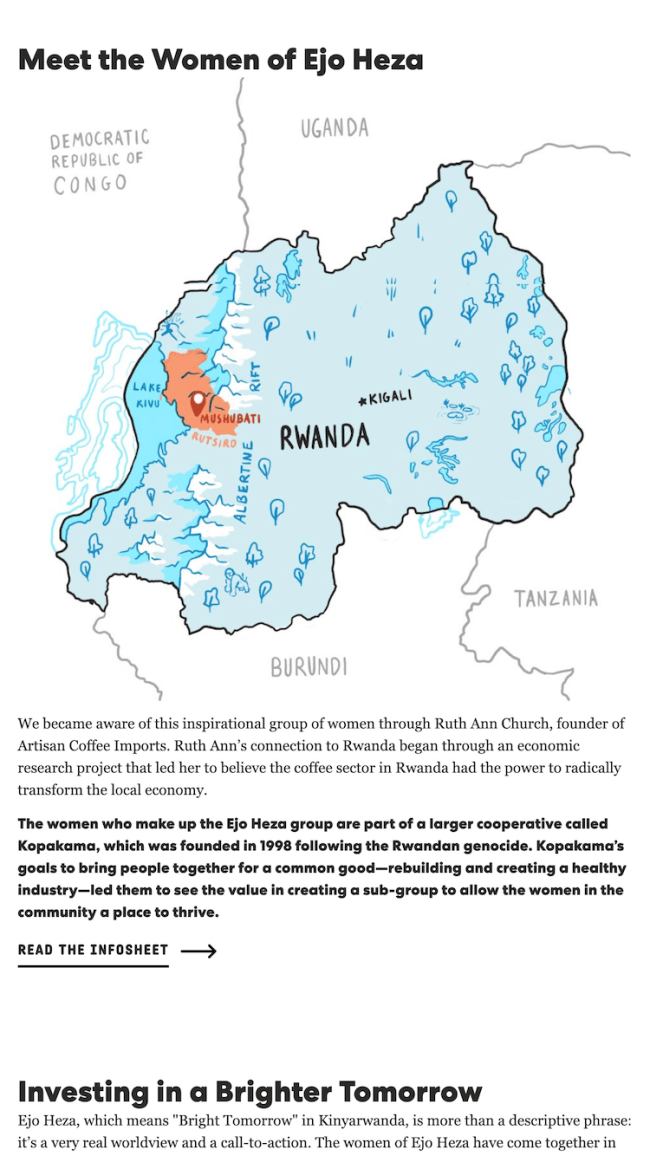
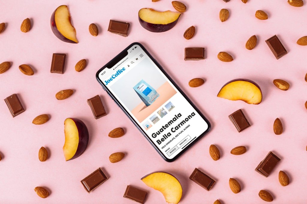
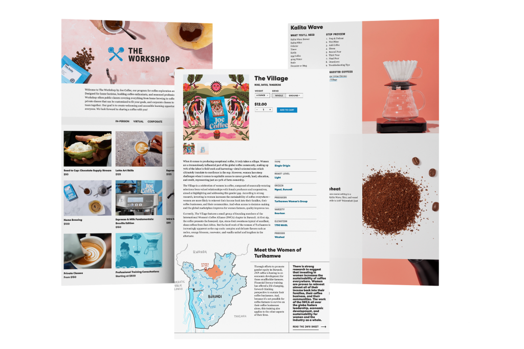
Each coffee gets a page that tells you where it came from, what it tastes like, and why it’s worth trying. The layout keeps things clean so the photography and the details can do their work.
Brew Guides
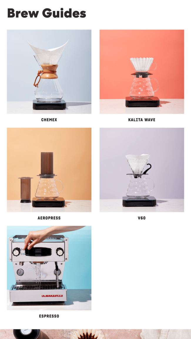
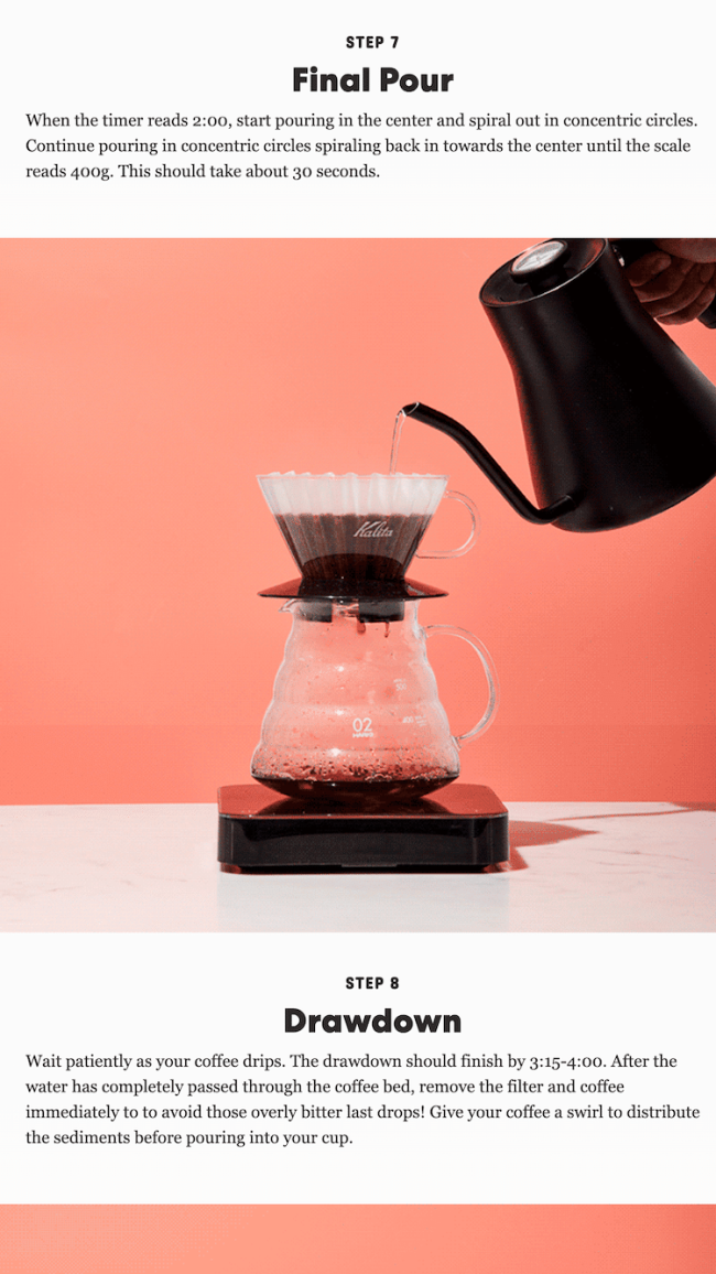
The brew guides round out the experience. Clear instructions, compelling photography, the kind of thing that makes customers feel supported once they’re ready to drink their coffee.

The Subscription Builder
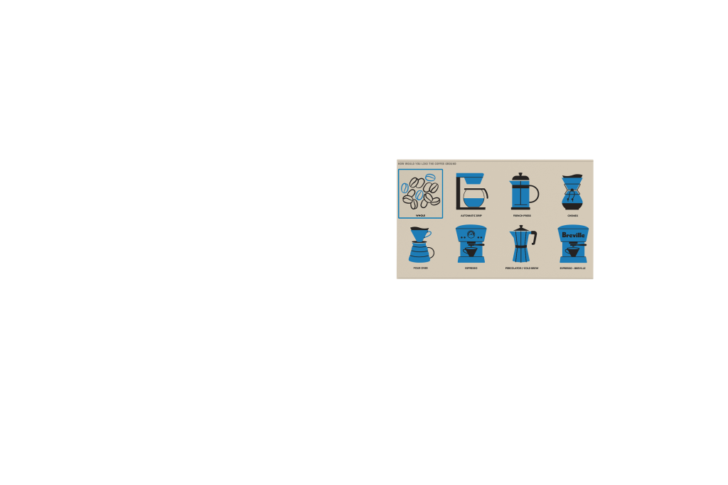
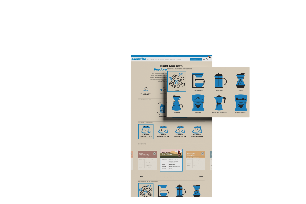
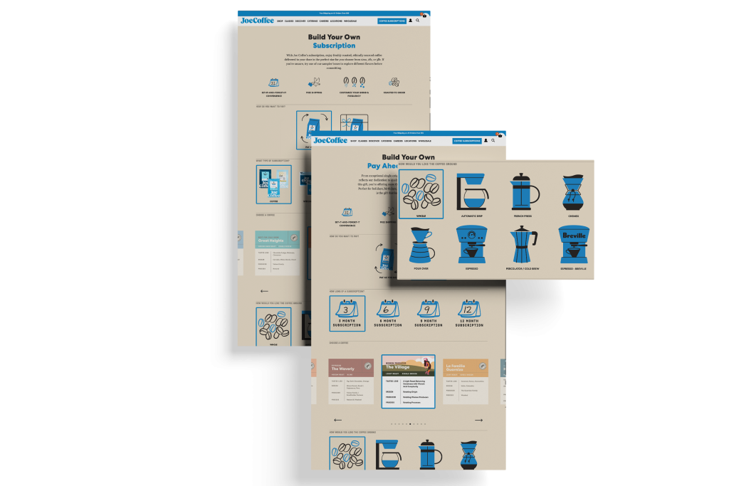
The subscription flow walks you through choosing your coffee, your grind, and how often you want it delivered. It’s designed to feel like getting a recommendation from a good barista: helpful and low-pressure, never overwhelming.
