Typography plays a huge role in web design, since 95% of the information on the web is written language.
Modern web browsers offer many typographic features which were previously exclusive to print. This has opened the door to a whole new universe of possibilities, particularly when these features are combined with modern, well-designed fonts.
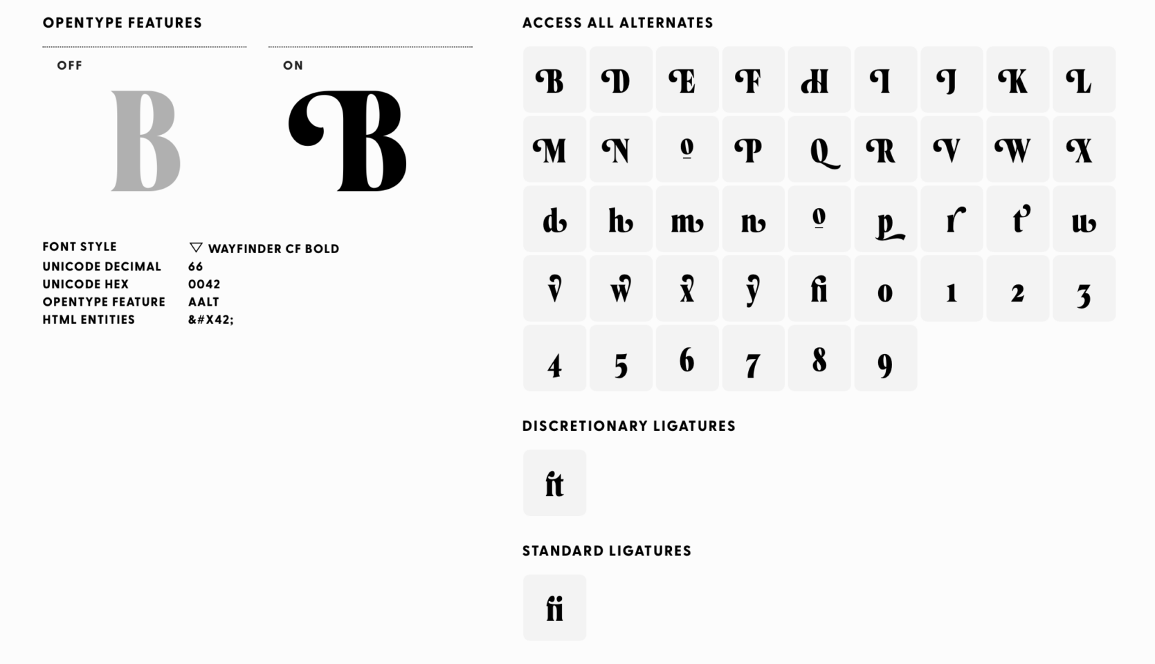
Here at Needmore Designs, we recently decided to refresh the typography of our website. One of the most significant changes we made was the introduction of Connary Fagen’s Wayfinder font for our headings. This particular font, like many others of its caliber, offers a range of features such as ligatures, swashes, and alternates.
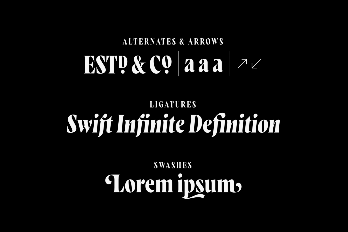
These add a whole new dimension to typography, enabling designers to create aesthetically pleasing and unique designs, giving a website much more of a hand-crafted feel. You’ll want to familiarize yourself with font-feature-settings and understand how to optimize them for your specific requirements.
For example, the range of alternate glyphs in Wayfinder is a bit daunting, and just enabling them all makes your content look terrible. We found, however, that adding swashes to just the first letter of a paragraph looks great. This was accomplished using the ::first-letter selector in CSS.
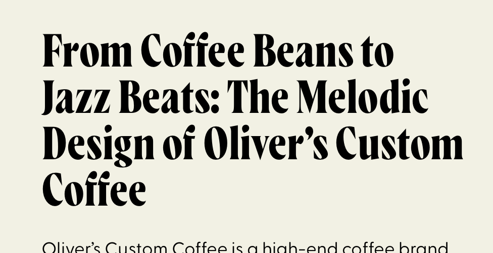
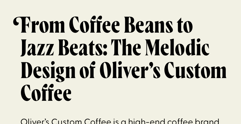
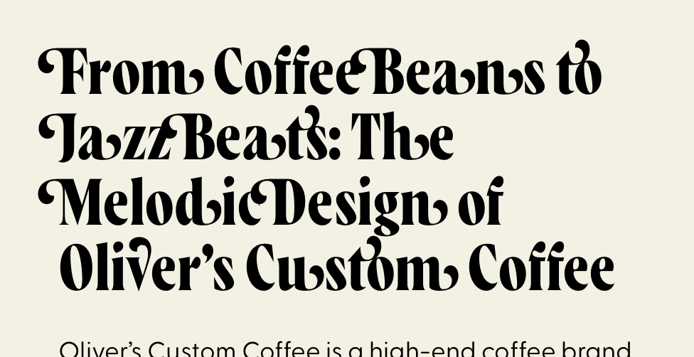
Most of the modern typefaces we select for our clients have OpenType Features, and we take advantage of that. If a website is heavy on numerical data, for example, we may choose lining figures instead of oldstyle figures for the numbers.
One potential pitfall to watch out for is browser behavior. We’ve observed instances of Safari, in particular, cropping off some of our more lovely swashes. One can get around that to some degree by combining negative margins with positive padding in a way that cancels itself out, but this is far from ideal. It’s worth taking the time for plenty of testing when using some of these techniques, because many browser rendering engines behave a bit differently.
Embracing the capabilities of modern web typography can significantly elevate the overall aesthetic of a website, lending it a personal touch that would have been all but impossible a decade ago. It’s quickly become one of our favorite parts of the design process.


