As avid users of both Trello and Dropbox, we at Needmore were thrilled when Dropbox integration for Trello was announced. This is a really clever way that Dropbox lets other services use a chooser dialog box to attach files, and it eliminates the duplication that you might otherwise have if you were to attach random files directly to a card in Trello.
Since the file you’re attaching in Dropbox is the actual file we’re using for production, should it get updated by someone on our team, Trello will always be linking to the current version.
However, Dropbox’s implementation leaves a lot to be desired. Let me show you what I mean. Here’s how this kind of interface appears on my Mac:
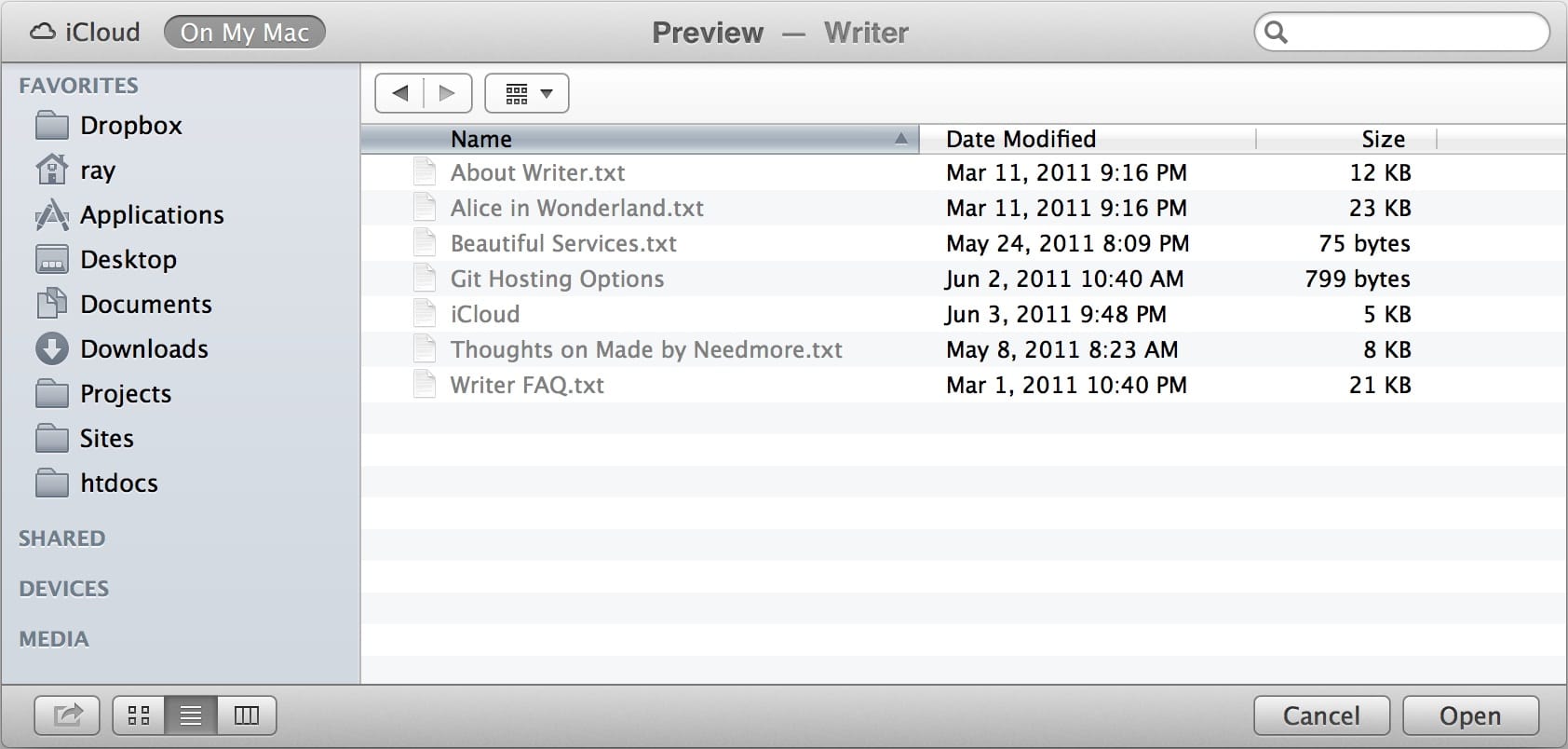
You can actually choose to view them as icons, as a list, and as a series of lists that you drill down. There are numerous other options for sorting them, and you can actually see a large preview in one of the views, which is very handy. Compare this to Dropbox:
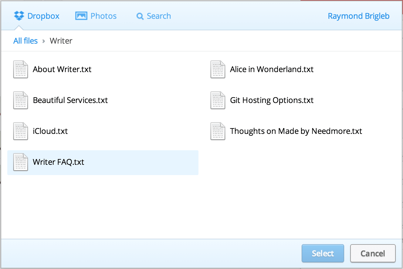
There are no such options here. I wouldn’t mind this too much, as a fan of simple software, if the defaults made sense to me. But they don’t.
The problem is that you’ve got a list of items that is sorted alphabetically in two columns, but your eyes have to scan from left to right the whole way down. When I first saw this interface, I assumed that it would be stacked vertically down one column, then down the next, and so forth. And I thought the file I was looking for wasn’t there, because I didn’t scan both columns!
Interfaces like this force the user to do too much work to make sense of the files. It would be better if Dropbox had organized the view so that you could scan in one direction, then start over, without missing anything.
It seems to me that Dropbox has made a usability mistake, and I hope that they fix it soon.