I’ve been trying a change at work. I’m very reluctant to get too comfortable with a piece of software once the developer abandons it, and that seems to be the case with my favorite workhorse text editor, TextMate. It hasn’t seen any real updates in a couple of years, and it’s a bit frustrating.
But it’s a very unique piece of software, and five years of constant use has gotten me pretty comfortable with it. If it stops working, I need an alternative. I’ve decided to give BBEdit a try. But it’s a tough transition.
BBEdit drives me crazy with its inability to smoothly scroll. I’m used to the native Mac OS X behavior, and it seems like common sense. When you scroll your text, it’s a smooth motion. Just like your web browser works. Just like almost all software works. I like that.
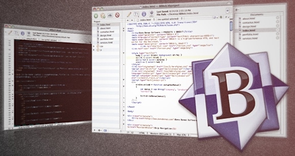
I suspect there are technical reasons why BBEdit behaves this way, but it’s tough for me to get used to. In BBEdit, scrolling “snaps” to each line of text. So when you scroll, it’s not a smooth motion, you snap one line at a time, up and down. But there are consequences. Have a look at these images, first of BBEdit, then of TextMate:


This is exactly how the windows opened for both apps. Same text. Without looking at the scroll bar, when you glance at the first image, you assume you’re looking at the end of the file. But you’re not! There’s more content, which is obvious in the image on the right. I’m constantly getting tripped up by this, and it’s a problem.
The way scrolling normally works is something we’ve all gotten used to. It gives us little visual cues as to when there’s a bit more content just outside of our view, and it’s good design. Little issues like this in BBEdit make it very hard for me to use.