By the dawn of the Sixties, the books published by Penguin were looking tired and dated. They were a great design ten years prior, but printing technology (and book design) was getting increasingly sophisticated, and buyers were passing over Penguin books because they looked old. Something was needed to make them look exciting again to the book-buying public.
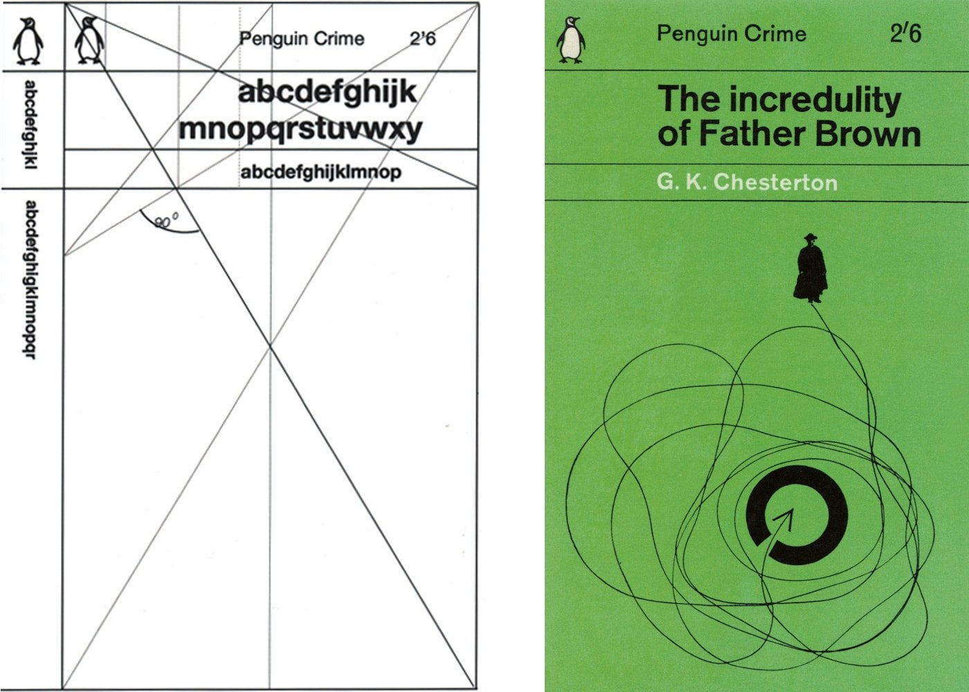
Romek Marber had been designing for The Economist and had impressed Penguin’s art director Germano Facetti, and so Marber was one of three designers (alongside fellow designers Derek Birdsall and John Sewell) tasked with a proposal to redesign the book covers.


Marber also had the opportunity to design a few covers for Penguin before the grid proposal.
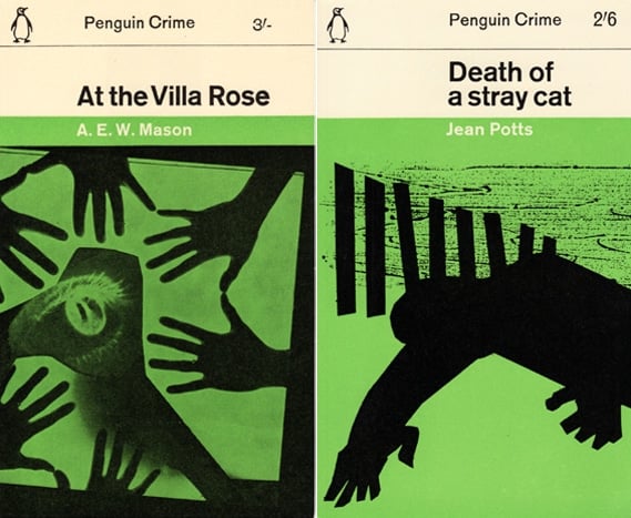
The crime series from Penguin was a very popular series, and Marber wanted to be sure audiences could still identify the books after the redesign. Hence, he kept the green color, but lightened it. The three lines in the top third were meant to also remind customers of the old design, while looking more modern. Most of the space was kept clear to allow for imagery.
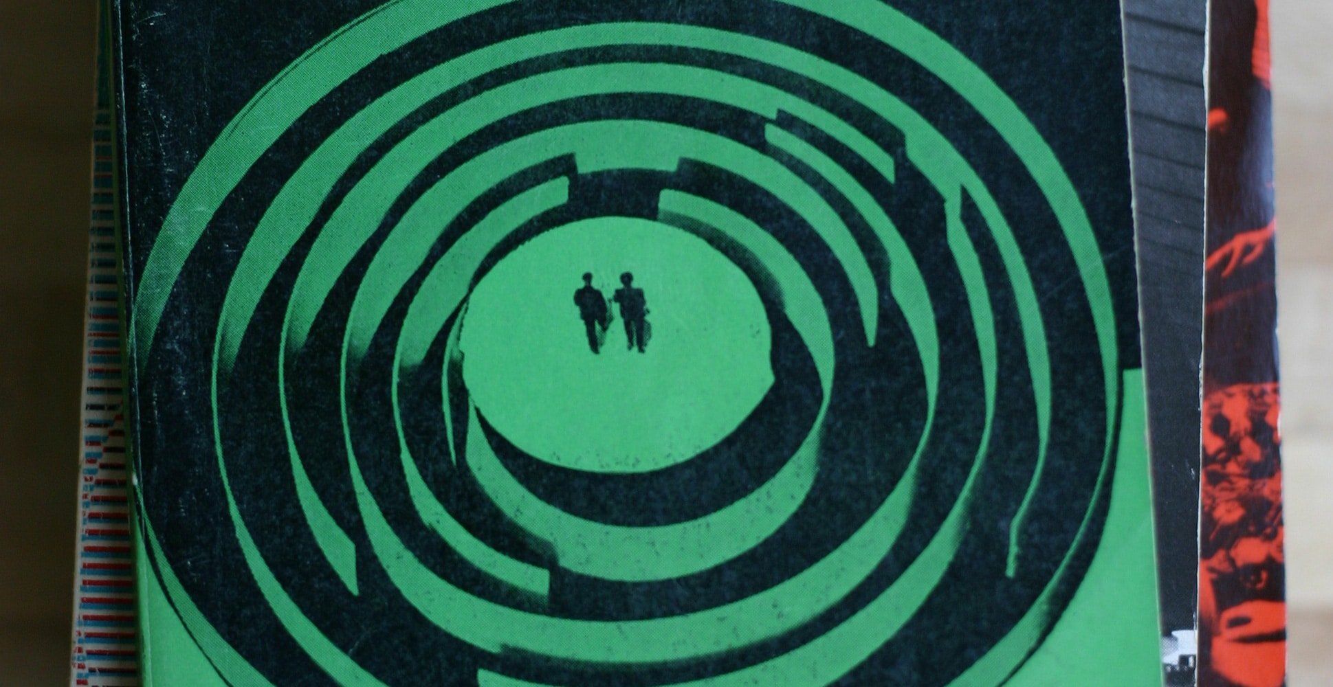
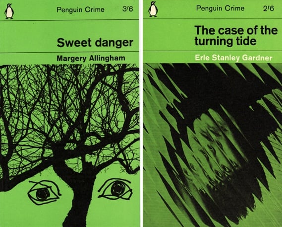
The first several dozen of the series also featured artwork designed by Marber, and were very interesting for how the worked within the constraints of the medium, and used creative imagery to reflect the mood of the books.

Over time, the design was so successful it was expanded into other lines published by Penguin. It has gone on to become one of the most famous grid designs of all time.