(Or, How I Learned to Stop Worrying and Love the New Basecamp)
Project management systems are pretty important to Needmore. They help us sort out roles and responsibilities on all our projects, they act as a repository for key pieces of information on said projects, and they act as a window through which much of our interaction with our clients takes place.
So it is not without a great deal of thought that we considered moving to the new Basecamp. We had been users of the “classic” version for almost as long as the product has existed, and it’s been a pretty good fit for our business. The product was pretty straightforward for us and our clients to use, it was reliable, and it matched the expectations you would have for that type of system when running our type of agency.
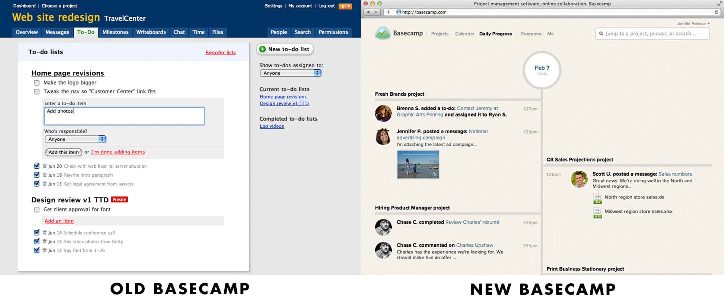
The new Basecamp is a complete rethinking of the whole system. Gone are many of the things we’d gotten used to from the previous version, features like time tracking, categorization, custom branding, and private messages. Features we’d grown accustomed to, which had no chance of going unnoticed. We resisted for as long as we could, but with the advent of a couple of improvements, we finally relented.
I wanted to explain why.

It’s not that the new system has grown dramatically better. It hasn’t. It’s still full of maddening drawbacks, lacking fairly basic features from the previous version to this day. However, the company is clearly focused on this product. In our experience, they tend to focus on a single product, and improve it step by step. For as long as that trend continues here, there is some hope.
Also, there are obviously improved aspects. Looping people into conversations is cool, as are the realtime updates throughout the application. And the ability to forward emails into the system. And many features I had believed were absent are still there, just difficult to locate, such as revisions for text documents (previously known as Writeboards.)
I’m also a huge fan of the new design. I think there’s a lot of room for improvement, and the layout of the old Basecamp was admittedly comforting in its adherence to web design tradition, but the new version has a lot going for it. It’s nice to see a service like this embracing a nontraditional font. It’s nice to see interesting decisions like the frequent use of circular elements. As a design agency, the actual design of the product is enjoyable. It’s the biggest single improvement I’ve found.
So hopefully the improvement continues. I’d love to see categories return – I miss them – or perhaps tagging of some kind. Simple chronological ordering for every single item is tiresome and crude. And I’d also love to have some kind of private message facility.
Finally, the web app is not enough. I’d appreciate an iPhone app. The Highrise app has gotten decent. Not great, but decent. The web app for Basecamp isn’t good enough. I appreciate their decisions in making it, but for a product that’s so simplified and streamlined, I feel like the mobile experience has actually gotten more frustrating and complicated. An official app would help. 37signals should look to Trello for an example of an excellent iPhone app with similar capabilities.
In conclusion, it’s an imperfect decision, but the new Basecamp is still probably the best thing going now for project management for a studio of our nature. We’ve been shopping around, but the combination of features and product design decisions that go into 37signals apps continue to set very high standards.