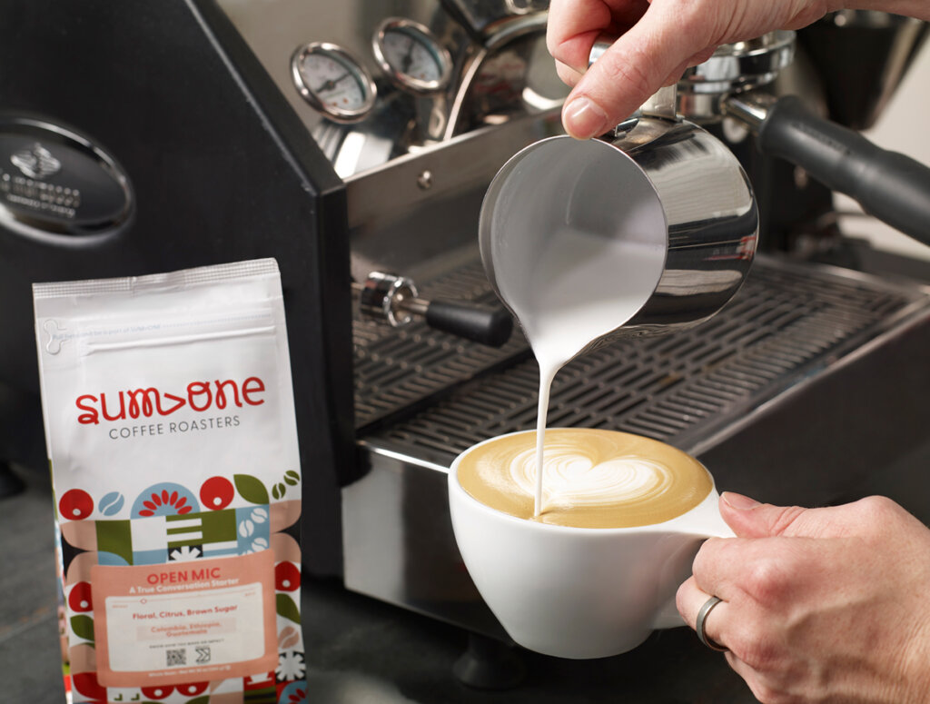
Sum›One
Designing a visual ecosystem where geometric harmonies echo coffee’s journey
Client
Farmer Brothers
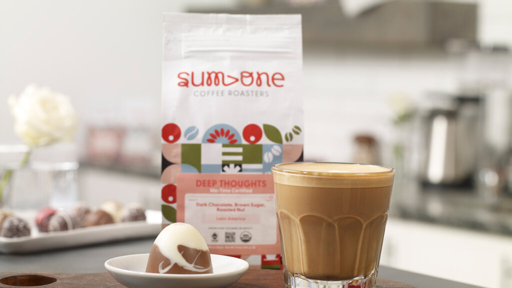
Lifestyle Photography Courtesy

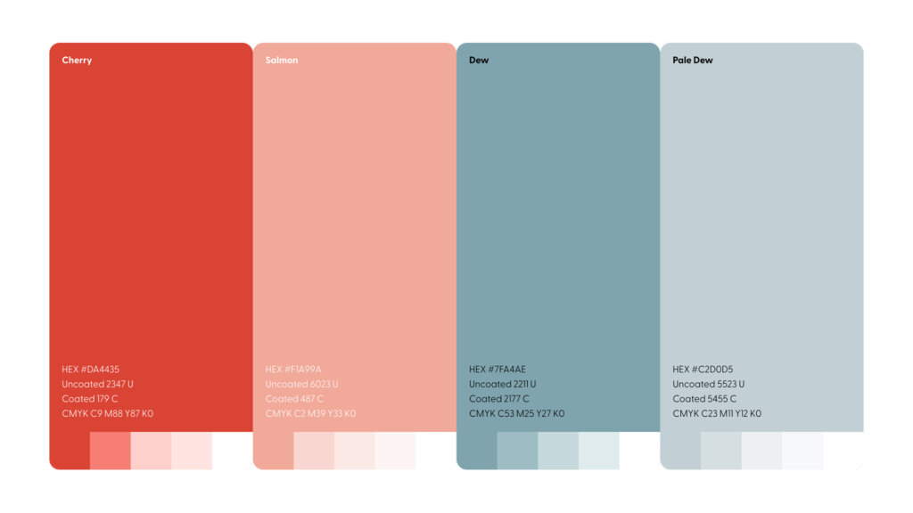
Color Palette: Mapping Coffee’s Journey Through Color
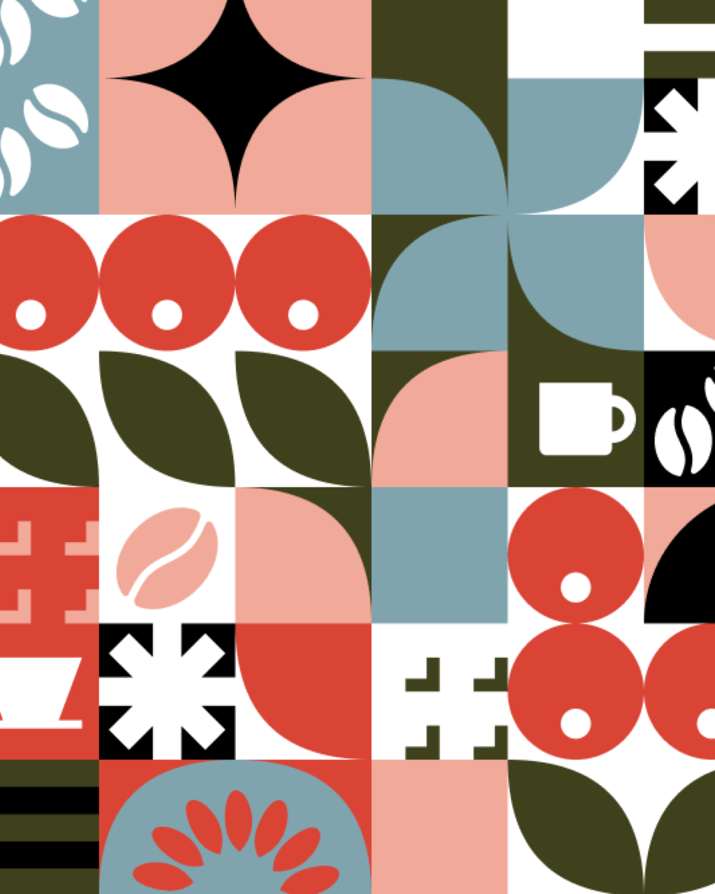
The Sum>One color story unfolds as a visual narrative connecting distant worlds. Warm Cherry and Salmon tones emanate the vibrant energy of coffee cherries ripening under equatorial skies, while cool Dew and Pale Dew blues invoke the crystalline waters that nurture coffee’s growth. This thoughtful chromatic dialogue creates a visual bridge between the environments where coffee begins its life and the spaces where it completes its journey — in the cup, in the moment, in community.
Pattern Language: The Rhythm of Coffee’s Lifecycle
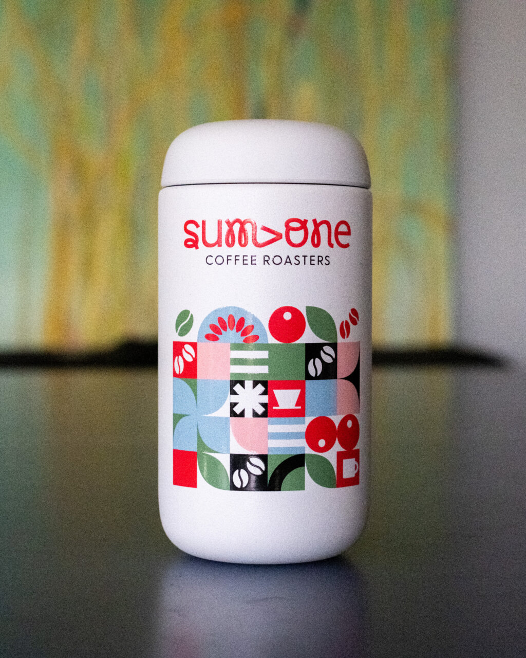
Every great performance requires choreography, and Sum>One’s distinctive geometric pattern serves as the visual score for coffee’s journey. Each icon — from beans and cherries to brewing vessels and cups — becomes a note in this visual symphony, arranged in a rhythmic grid that creates movement across the package surface. The pattern isn’t merely decorative; it’s narrative, transforming packaging into a storytelling medium that celebrates coffee’s complete lifecycle.

The Monogram: Beginning and Endpoint
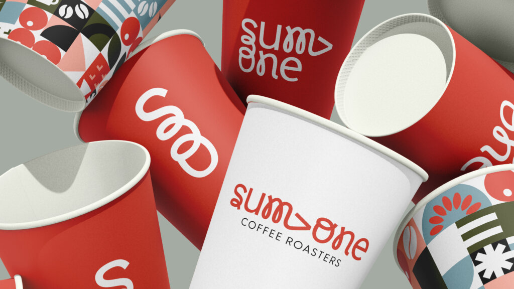
At the heart of the Sum>One identity stands the distinctive “S” and “O” monogram — a visual haiku that simultaneously evokes a sprouting seedling and steam rising from a freshly brewed cup. This deliberate visual metaphor connects coffee’s beginning and endpoint, creating an immediate, intuitive understanding of the brand’s holistic approach to coffee’s journey.
Packaging: Canvas of Visual Rhythm
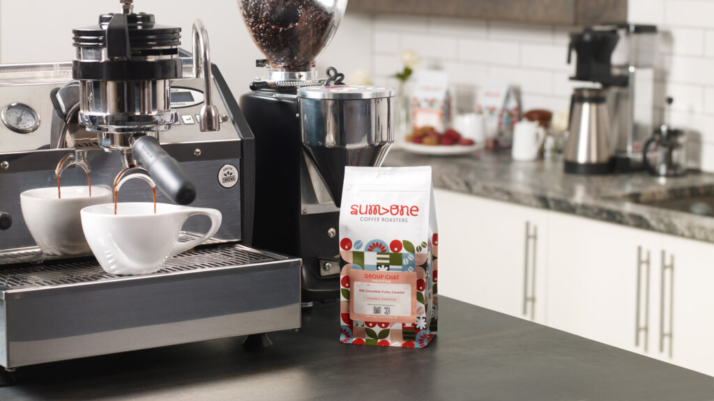
Sum>One’s packaging design transcends functional container to become an immersive sensory journey. The bold visual storytelling captures immediate attention through layers of meaning — each surface transformed into a dynamic canvas where geometric patterns pulse with rhythmic energy. These patterns aren’t merely decorative flourishes but narrative elements, each icon carefully chosen to represent a chapter in coffee’s journey from origin to experience.
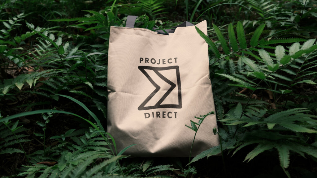
The impact-focused labeling becomes a window into coffee’s journey, with dedicated space that immediately communicates their sustainability commitment through the Project DIRECT initiative. By putting a comprehensive approach to sustainable coffee sourcing front and center, the packaging becomes both messenger and message, its physical form embodying the brand’s commitment to meaningful connection at every level of coffee’s journey.
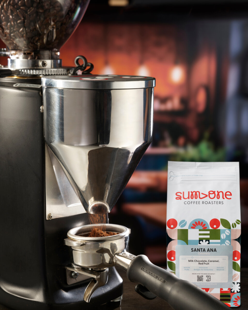
Brewing Momentum: Sum›One’s Market Debut
The March 2025 launch of Sum>One Coffee represents Farmer Brothers’ bold entrance into the specialty coffee landscape — a strategic evolution for the 113-year-old coffee industry pioneer. As reported by Daily Coffee News, this new brand emerges as a pivotal development in Farmer Brothers’ portfolio, offering a curated selection of single-origin coffees and signature blends designed to appeal to discerning coffee enthusiasts while maintaining accessibility.
As Sum>One takes its place in Farmer Brothers’ portfolio alongside brands like Farmer Brothers Coffee Co. and Boyd’s Coffee, our design system provides the visual foundation for a brand that bridges worlds — honoring coffee’s craft traditions while embracing contemporary sensibilities, respecting industry expertise while welcoming curious newcomers. The result is more than a coffee brand — it’s a visual and sensory invitation to participate in coffee’s most meaningful conversations.
