
Stanza
Poetry Meets Pour-Over in Doha
Services
Client
Stanza
Lifestyle Photography Courtesy


Cultural Infusions and Brewing Heritage
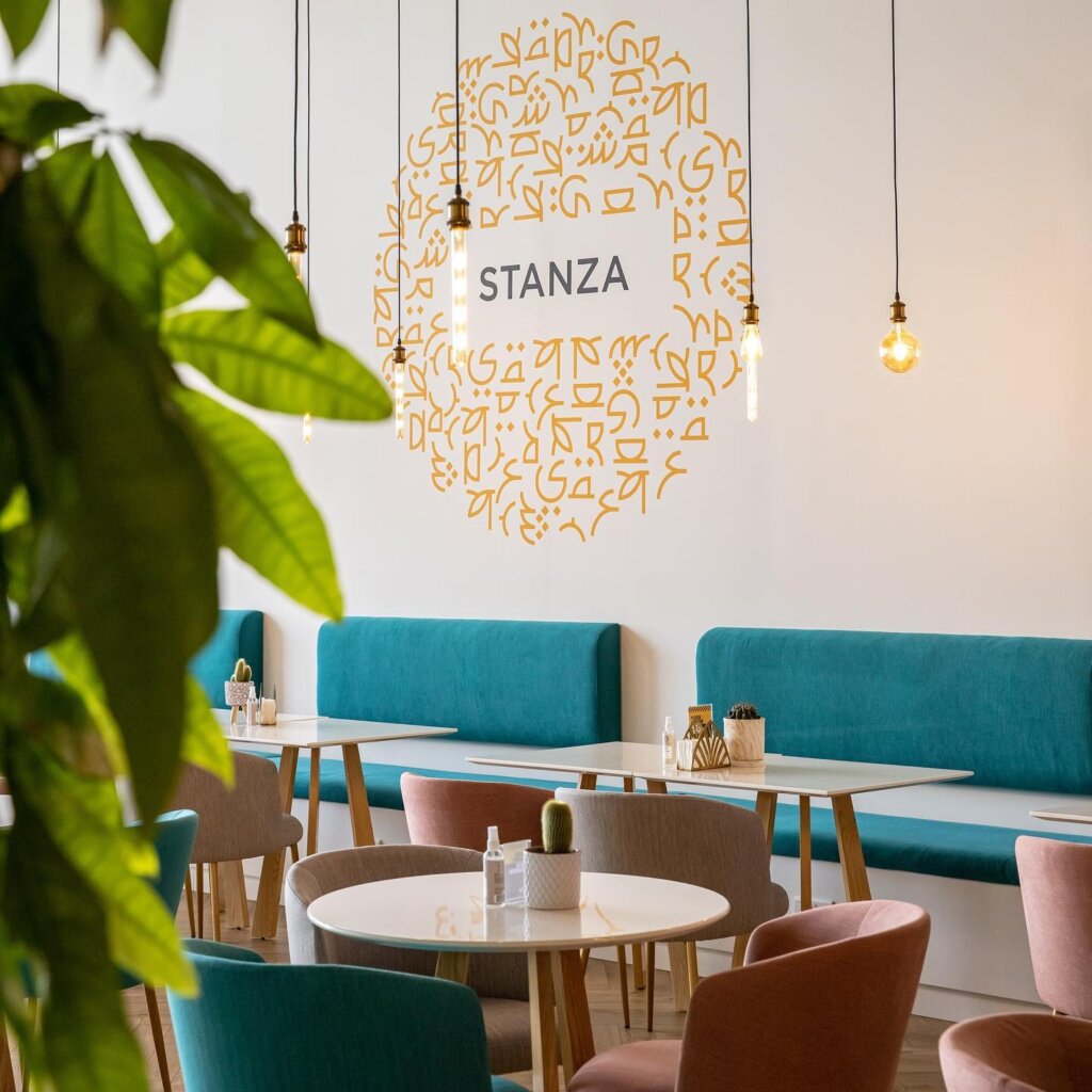
The Arabian Peninsula’s relationship with coffee transcends mere consumption — dating back to 1450 AD, it flows through the region’s cultural veins as a ceremonial embodiment of friendship and hospitality. Traditionally confined to the intimate sphere of home visits, these rituals remained hidden treasures. Stanza boldly reimagines this tradition, transforming private ceremony into public celebration, inviting patrons to experience this cultural cornerstone within a contemporary canvas.

The Naming Narrative Behind Stanza
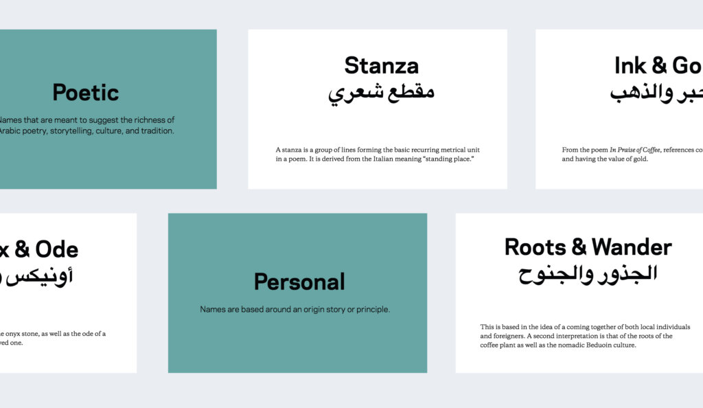
Our journey with Nasser revealed rich thematic tributaries — exploration, wanderlust, growth, and discovery. As conversations deepened, we found ourselves immersed in the rhythmic cadence of Arabic poetry, where stories and traditions intertwine like arabesque patterns.
The name “Stanza” emerged organically from this cultural immersion — a universal metrical unit in poetry that transcends linguistic boundaries. More than merely a word, Stanza embodies multiple dimensions of meaning: a building block of poetic understanding, literally “a place to stand,” and the foundation upon which Nasser would compose his own entrepreneurial verse — one welcoming smile, one perfectly brewed cup at a time.
Visual Verses and Typographic Symphony
Creating Stanza’s visual identity demanded a delicate balance — distinctive memorability paired with authentic cultural resonance. The resulting brand language speaks in visual verses, combining contemporary sensibilities with historical reverence.
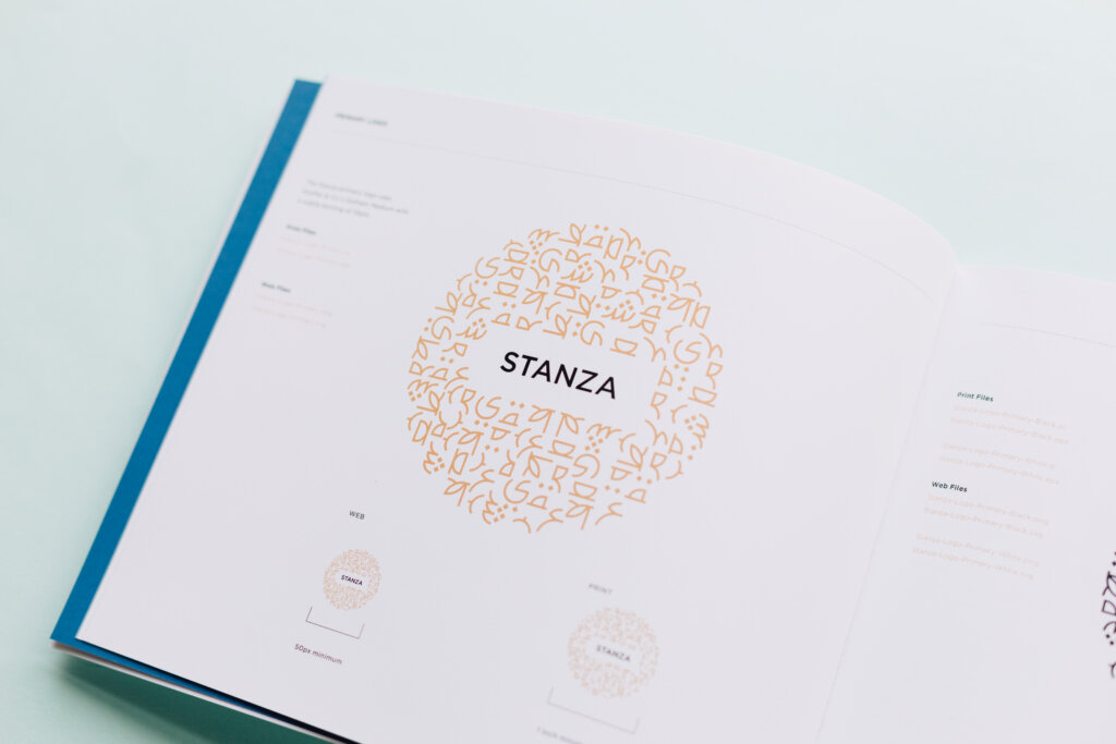
The wordmark orchestrates a typographic dialogue between Hoefler & Co.‘s Gotham Medium and the Arabic typeface Falak. Gotham brings a paradoxical freshness wrapped in familiarity, while Falak — inspired by astronomy and natural science — contributes orbital curvatures and spatial proportions that echo the celestial. Together, they create a typographic constellation that bridges cultures through visual harmony.

A Palette of Perceptual Metaphors
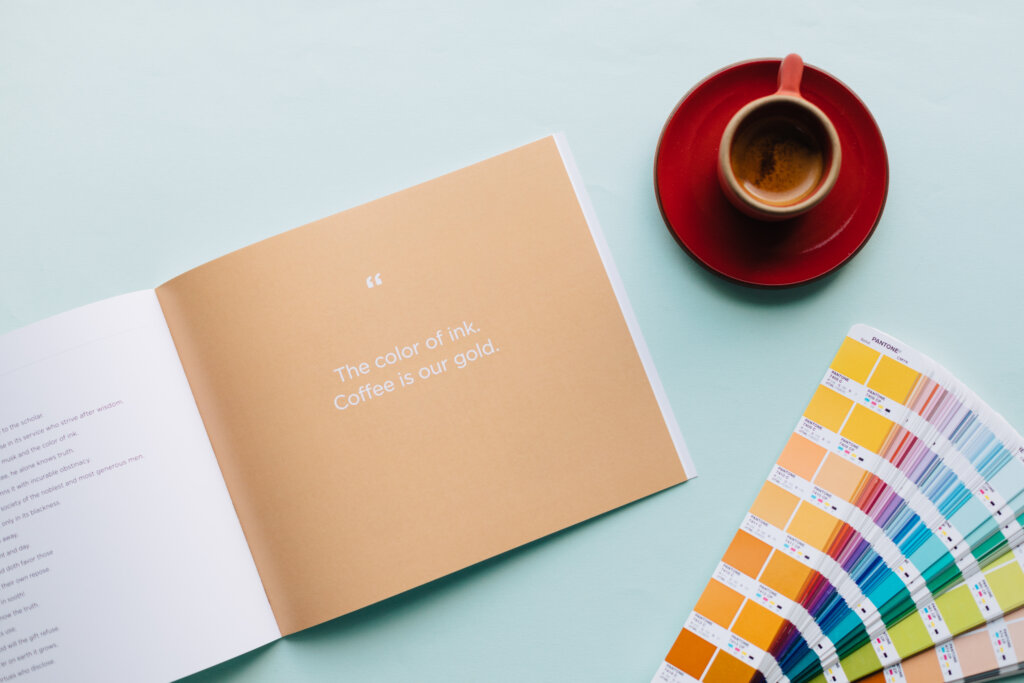
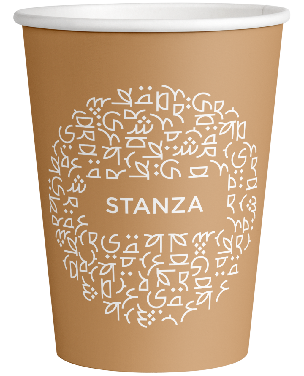
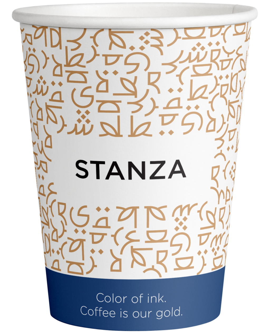
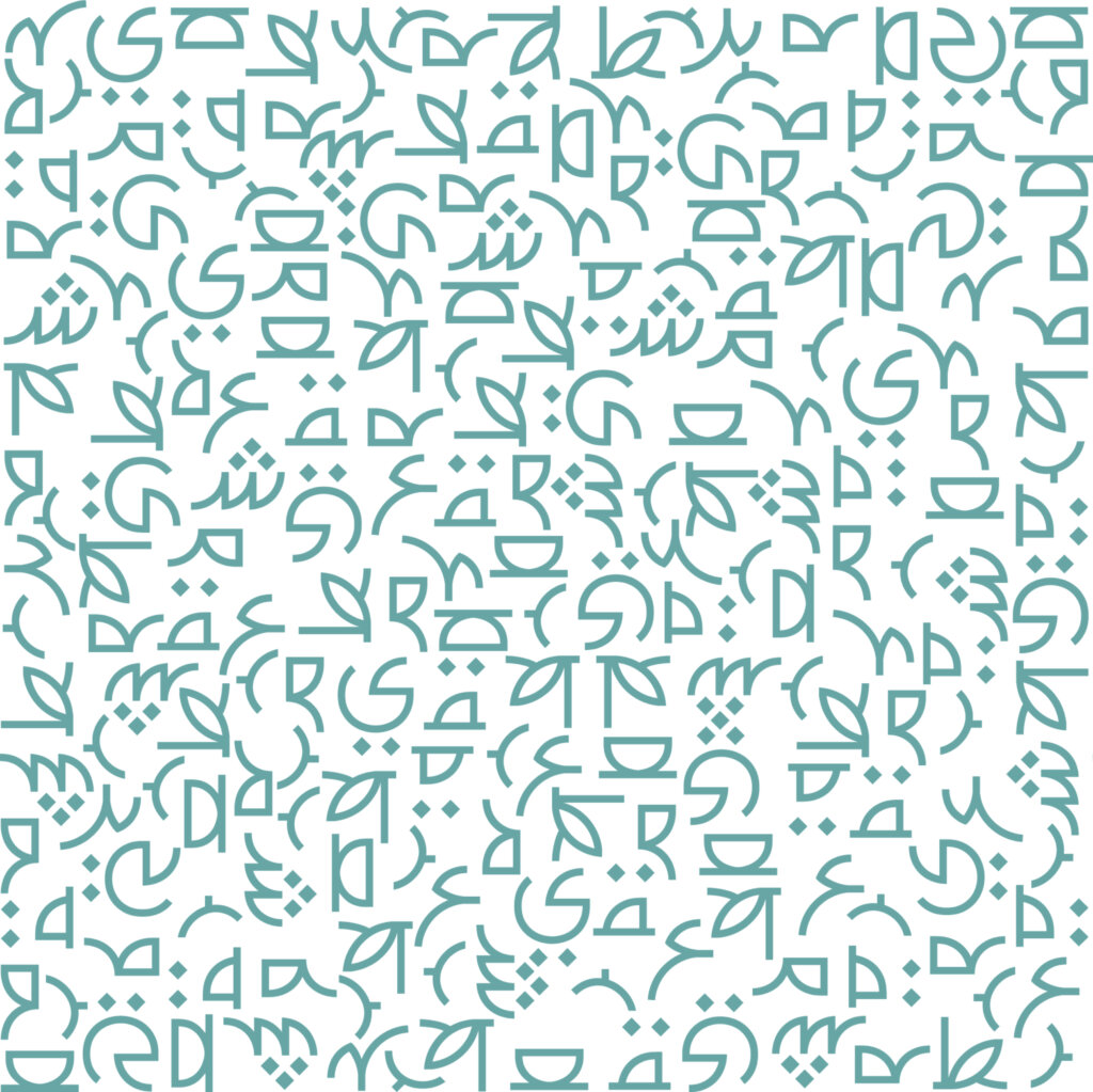
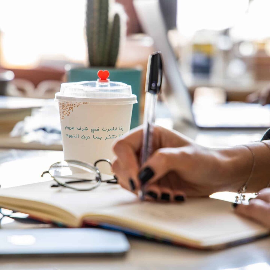
Each color in Stanza’s palette tells a story. Deep blues and teals whisper of Qatar’s maritime heritage, while warm gold hues capture the essence of “coffee is our gold” — a line from the 1511 poem “In Praise of Coffee” that adorns Stanza’s to-go cups. The palette creates a visual symphony where ink meets parchment, where tradition meets innovation.
Pattern Language and Architectural Inspirations
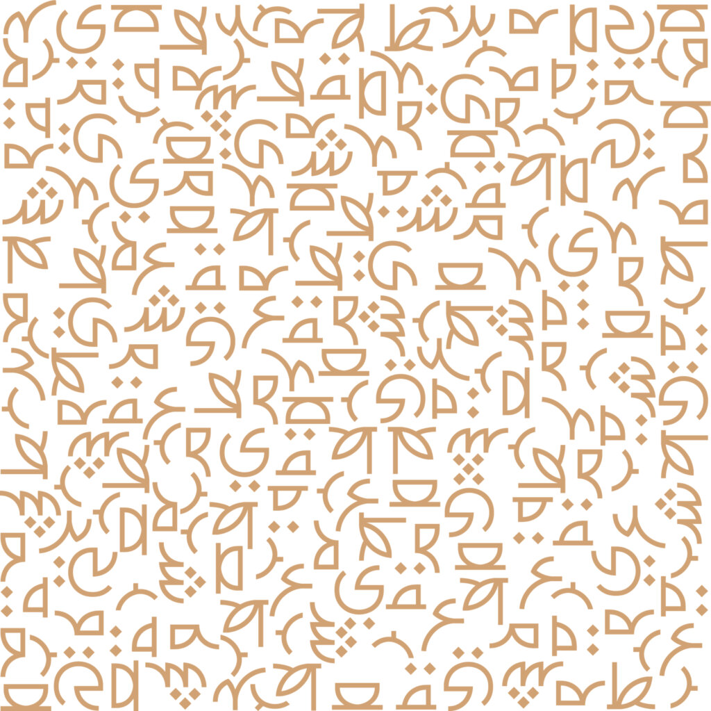
The distinctive patterning that flows through Stanza’s brand identity draws inspiration from the intricate geometric artistry of the Dome of the Rock walls. These patterns don’t merely decorate — they communicate. Each line and curve speaks to a heritage of mathematical precision and artistic expression that has defined Islamic visual culture for centuries, reimagined for a contemporary coffee experience.


Beyond Branding Through Cultural Conversation
Working with Nasser transcended typical client engagement, becoming instead a cross-cultural dialogue. Each design decision, from cup typography to spatial arrangements, emerged from an understanding that Stanza wouldn’t just serve coffee — it would serve as a cultural bridge, a poetic pause in busy lives, a place where traditional hospitality finds contemporary expression.
The world indeed needs more poetry, more spaces for connection, more Stanza — where every cup poured is a verse in an ongoing cultural conversation, and every visit becomes a chapter in a collective story of tradition reimagine

