Oren’s Coffee
Visual Cartography of a New York Coffee Legacy
Services
Client
Oren's Coffee


A New York State of Mind
In the electric heartbeat of 1986 New York, a humble coffee roaster planted its roots in the city’s rich soil. Nearly four decades later, Oren’s Coffee stands as a quintessential New York institution — a liquid testament to the city that never sleeps. Just as the city continually reinvents itself, there came a time when Oren’s visual story needed to evolve while honoring the narrative that made it beloved.
We began our journey as urban anthropologists, immersing ourselves in the symphony of New York’s daily cadence. The rhythmic pulse of subway cars, the mosaic of conversations in crowded cafés, the unspoken choreography of commuters navigating the city’s arteries — all became design inspiration.
Our muse emerged in an unexpected place: beneath the city itself. “When in New York and lost, just follow the subway signs!” This mantra became our guiding constellation as we descended into the labyrinth of vintage transit maps and the architectural poetry of subway structures. Here, in the intersection of movement and destination, we discovered Oren’s new visual language.
Transit-Inspired Visual Rebirth
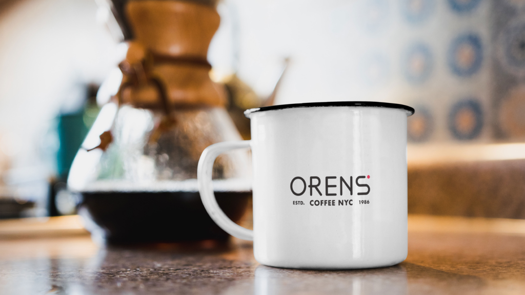
Oren’s reimagined identity draws its soul from Massimo Vignelli’s iconic 1972 New York Subway map — a masterpiece of clarity amid complexity. Our logo design captures the “dot to dot” journey of daily New York life, where Oren’s Coffee becomes both pathway and destination.
Like the subway lines that connect disparate neighborhoods into one unified city, our design elements create a visual system that’s simultaneously nostalgic and forward-looking — a modern interpretation of New York’s enduring character. Typography flows like pedestrian traffic, bold yet approachable, while color palettes evoke both vintage subway tiles and contemporary urban energy.
Embodying an Intricate Blend in Packaging Design
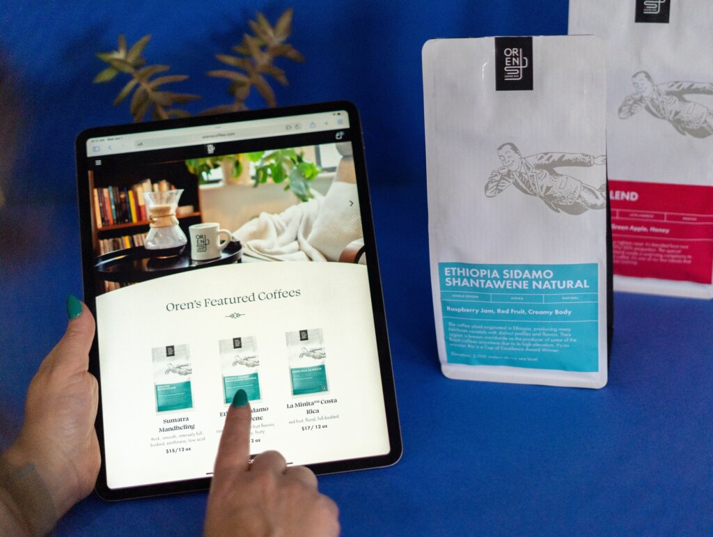
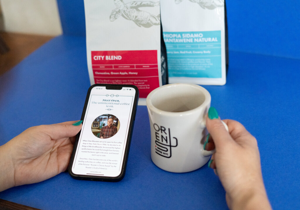
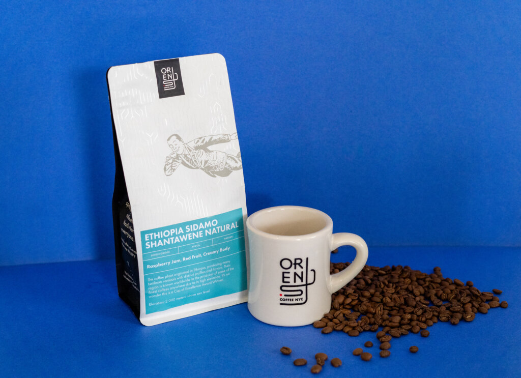
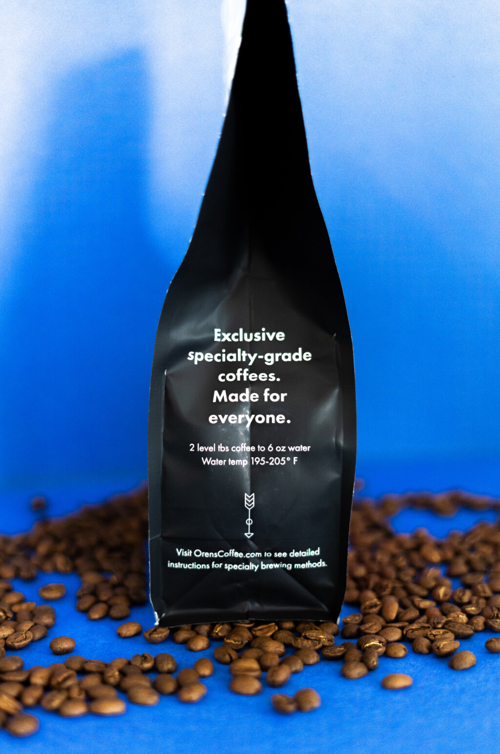
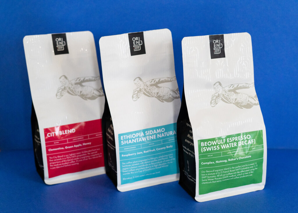
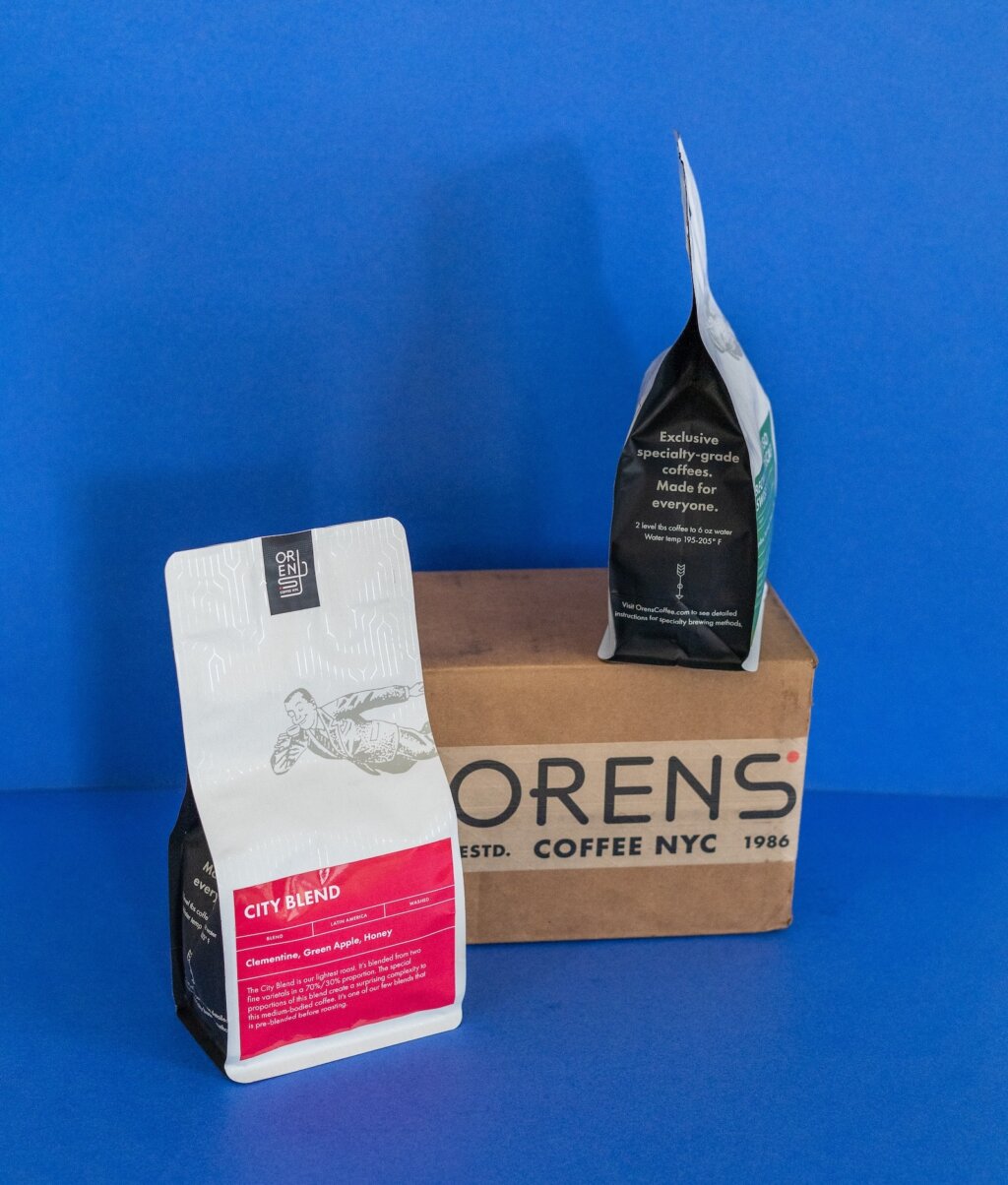
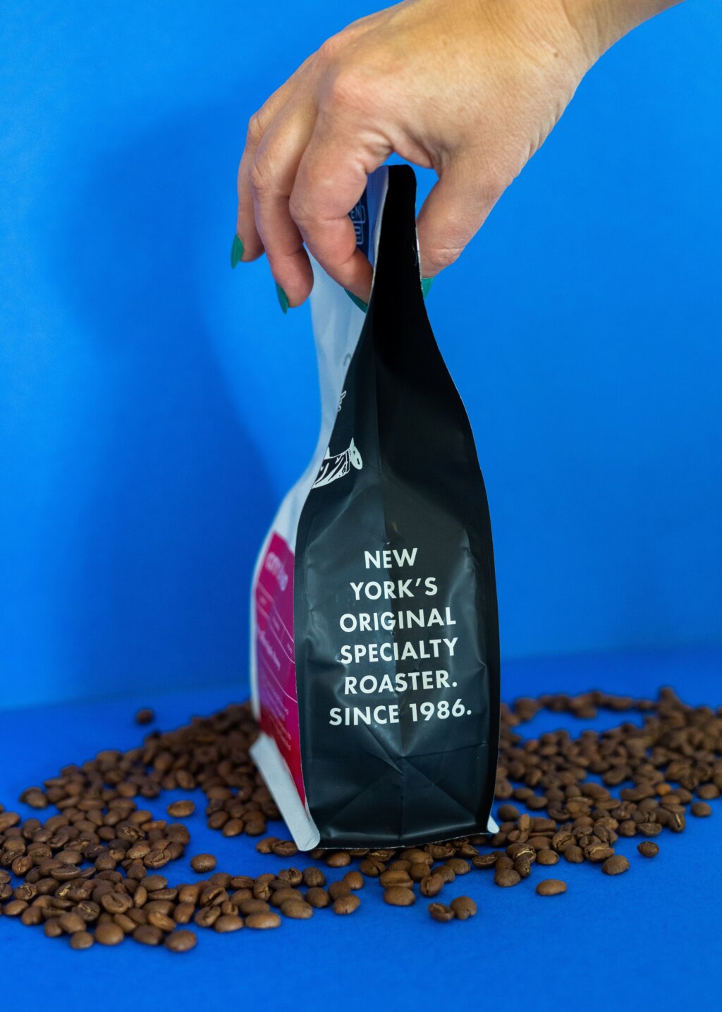
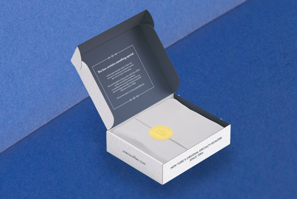
The packaging redesign transforms each coffee bag into a handheld New York moment — a Gatsby-esque artifact where Jazz Age sensibilities dance with contemporary functionality. The surface adorns itself in Art Deco patterning, where geometric precision meets golden-era opulence in a visual rhythm that pulses with metropolitan energy.
Oren’s iconic flying man illustration makes an appearance as a guardian of flavor soaring across the Art Deco landscape. His presence bridges past and present, hovering between heritage and innovation like a time-traveling curator of taste.
From Beans to Screens: The Digital Evolution of Oren’s Coffee
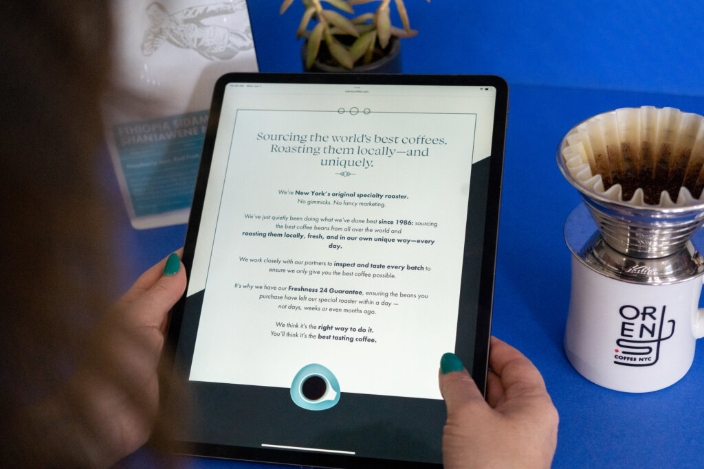
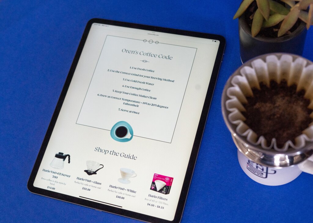
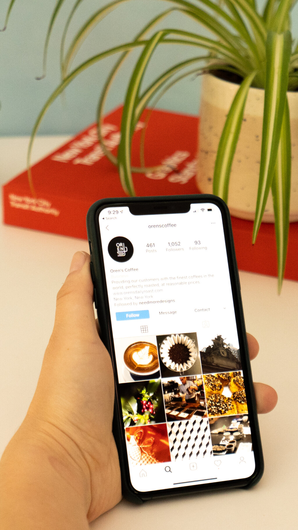
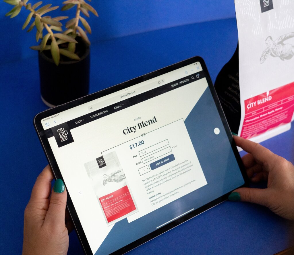
The revitalized Oren’s identity catalyzed a commercial renaissance, with sales climbing. This momentum became the foundation upon which we architected their new digital presence. The website design mirrors the brand’s refreshed visual language, where subway-inspired navigation creates intuitive pathways through a digital terrain rich with coffee discovery. Each interface element translates Oren’s no-gimmicks philosophy into visual terms, with clean typography that speaks with authority rather than decoration, and a streamlined information architecture that prioritizes substance over spectacle.
We crafted digital spaces where coffee knowledge flows without pretension — roasting narratives unfold with the same straightforward elegance as an expertly pulled espresso. The resulting digital experience becomes a virtual extension of the Oren’s philosophy — where quality speaks for itself, authentic relationships with customers matter more than trends, and New York’s practical sophistication infuses every interaction with purpose and personality.
