

Responsive website design is all about creating the best possible experience on multiple devices. Often, we achieve this simply by moving elements and changing image size as we move from device to device. Then, there are the critical moments—putting together a subscription, for example—that call for a more granular solution.
The starting line

Picky Bars are delicious real-food bars created by real-life professional athletes. Their Picky Club subscription is custom-made for busy fans on the go. This is a group that wants to join quickly and easily, from any device. By designing a custom sign-up experience, we enabled club members to manage their subscription from their phone or tablet just as easily as from their desktop.
Off and running on the desktop

We built the Picky Bars shop with WooCommerce so the backend of the subscription builder was straightforward. The primary challenge was designing an engaging, clear selection process that embodies the creative and passionate nature of the Picky team. Members add or remove flavors with a simple tap and see their order fill with colorful delight. (Geek bonus: the graphics are all vector-based and work seamlessly at all sizes.)
Handing the baton to tablet

Once we’re off and funning on a tablet, you’ll note fairly classic responsive design decisions; the club sign-up mirror the desktop design with relatively minor rearranging and resizing.
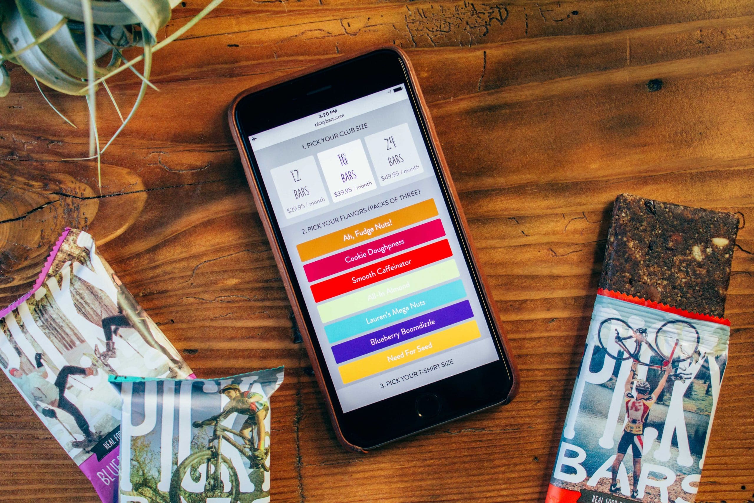
Sprint to the finish on the phone
Once we move to the phone, the design starts to change. Our first approach was to mirror the iPad. Problem was, this metaphor didn’t work on a phone. While the desktop layout makes it obvious when one has assembled an order, this was not at all obvious on the phone. The design took up to much vertical space to be easy to use without constant scrolling up and down to assemble or edit your subscription. Obviously, this wouldn’t do.

After rounds of prototyping, we focused on a winning approach for phones that retain the original design’s vibrant personality while simplifying ordering. Now, each flavor is a single button that indicates the number of bars of a type ordered. Boom.
The results
[vimeo id=145341227]The Picky Bars subscription page represents much of what is compelling about modern web design where the bar is continually being raised on what is possible and compelling in an experience across multiple devices.