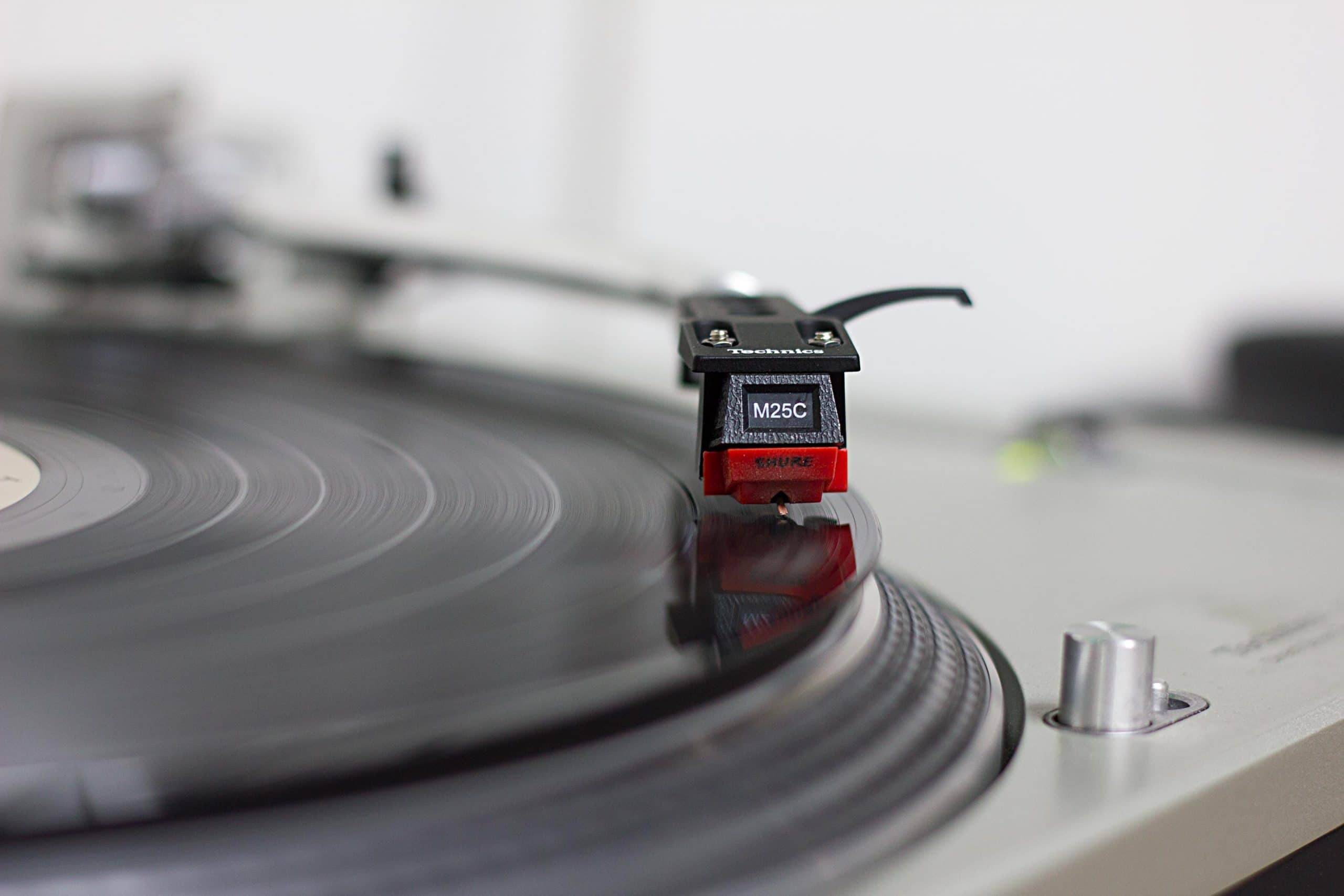
We love listening to records here at Needmore. We have more records than we have space to show. So, instead of storing them all like you might in a store, we store them with the spine facing out. Finding the record you want can be difficult. Unless, that is, the spine is designed to stand out.
Record spines are a mere 3mm wide, compared with over 300mm for the full album cover (and the back as well), so you have an incredibly small space to communicate. I often think of this as being a lot like your site’s name or URL in a browser bar, along with its favicon. These icons have to convey a lot, being only 16 pixels square (perhaps 32 pixels square, on a retina device).

Three tips
- Distinctive color. This is probably the biggest ingredient when browsing them. As large a space of a solid color as you can get, somewhat distinctive, can provide more visual recognition than anything else. This is why if a client has a complex logo, we will either redraw a simplified version of it, or show it reversed-out against a solid color. It’s much more recognizable.
- Distinctive shape. Also important, but with such a small area, you don’t have a lot of options. You should certainly make larger versions, which you can link to, for devices that might support them.
- All caps? Judging by the sampling here, I probably ought to suggest you write your site title in all capital letters. I’m not going to suggest that… but it does seem to be pretty effective on record jackets.

This stuff does matter. While Google doesn’t show favicons in search results at present, other providers do. Bookmarking services do, browsers do, and numerous other places rely on them. It’s worth taking the time to get them right, as their impact is certainly larger than their pixel dimensions on screen.
Make your favicon count!


