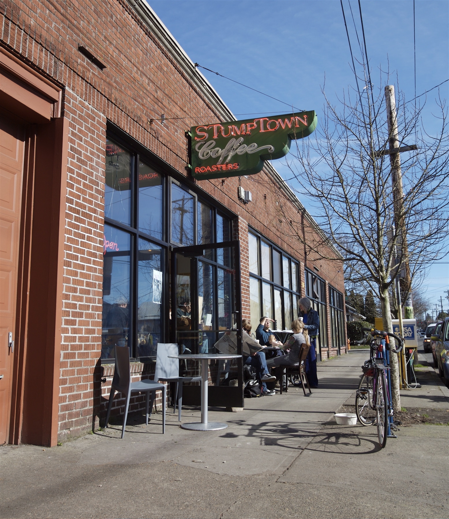
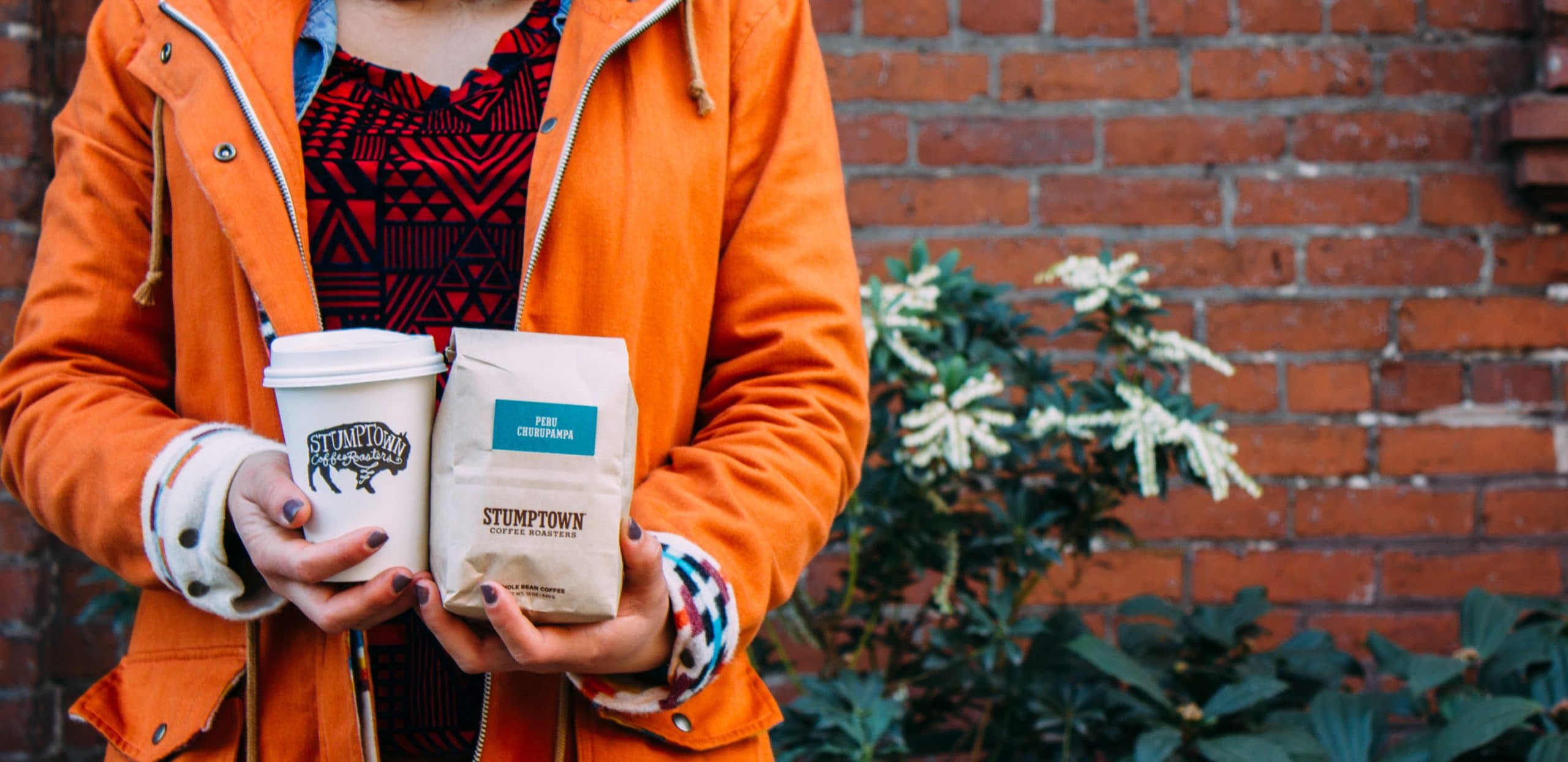
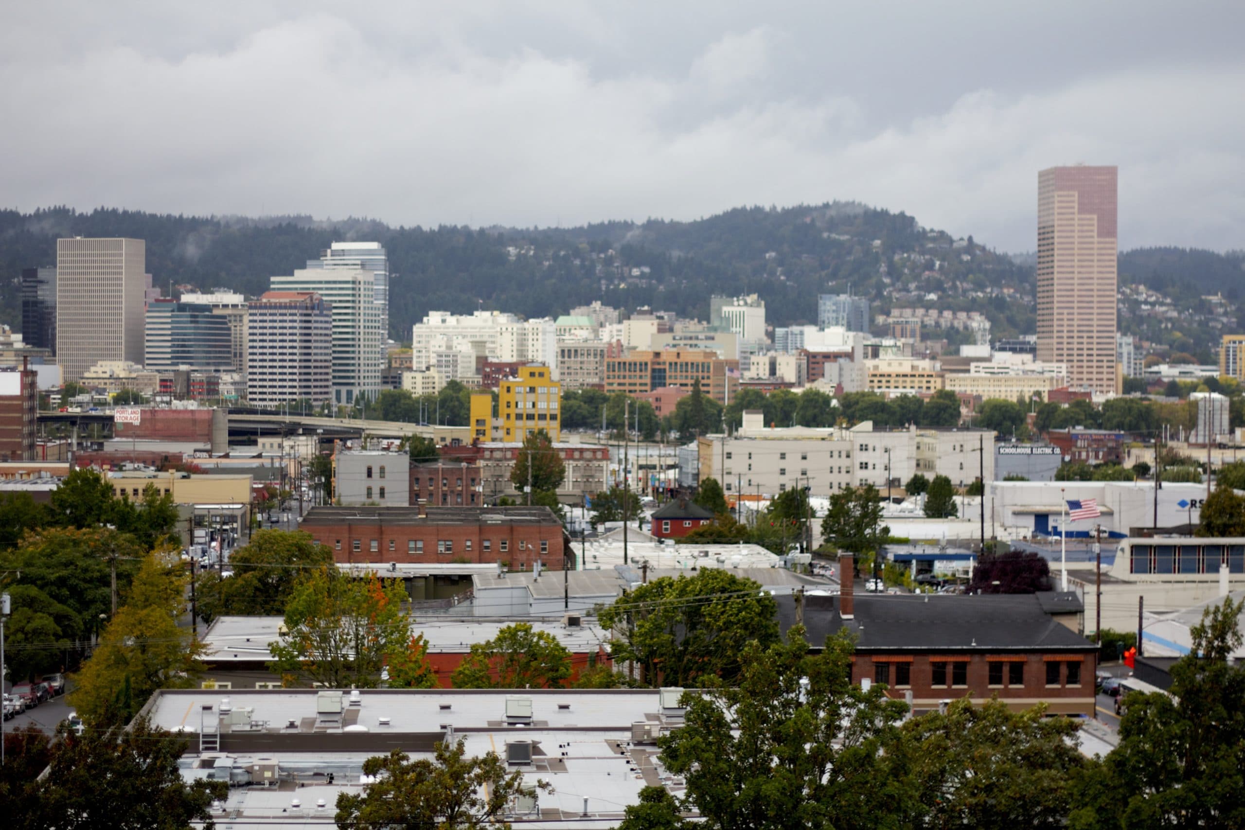
After getting feedback from our first round of ideas, we wanted to develop them further in the second round. As you can see, I wasn’t quite ready to let go of the lighter background, and snuck one in to this round:

This page worked great with a lighter or darker color scheme, and everybody loved it. The colors really worked, and matched the cards on the coffee bags very well. It was also nice that as you went from section to section, the colors changed to match the color scheme of the cards. The Latin America coffees have one color, the Africa coffees another, and so on.
Next we wanted to fine-tune the individual coffee page. We wanted to show every bit of detail that Stumptown knows about their coffees, including any number of photos, and also allow customers to add the coffee to their shopping cart right then and there. We also added the selection of coffee grind and quantity. Once you add it to your cart, you’re on your way.
Then we tried the Locations page. The old website was set up to handle more than one picture per location, so we continued along those lines. Unlike the old website, we were building this in HTML, so we couldn’t rely on Flash tricks to handle this feature. We instead used jQuery, a brilliant JavaScript library that lets you build these sorts of things very easily. For an extra touch, we used a semi-transparent PNG graphic to get the overlay on the right side, to show the details about that location right over the picture itself.
And here is a mockup of the Varietals page. The finished version looks almost identical. We have future plans to add other features to this kind of page, but we’ll go into that a bit more laters!


