Early last month, we were approached by AboutUs to design a couple pages for their website. They were planning on launching a feature called Site Reports, which lets average folks improve their site’s search engine ranking. It’s a great, affordable service, and we were excited to help out.
The work consisted of a page and a half, basically. First, just a simple block on the home page to build interest in the product. Second, we were to design a landing page to sell the service. This was definitely the “epicenter” of our efforts, and where we put most of our time and effort.
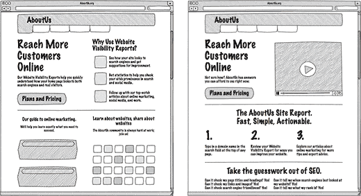
We started by tackling the wireframes. We wanted to be sure we got the copy and the general layout right from the start, before moving on to any actual design. Here is where we started.

These were the wireframes the client liked from the first round. Particularly for the sales page (right), they were excited about the way “each successive third of the page has increasingly more text density.” Very good. A few rounds later, we ended up with these final wireframes.

At this point the client was happy with what they saw, and so we moved on to the work of design. Our first round was extremely rough, but here’s what we had. Bear in mind that the home (left) page includes the existing content of the AboutUs home page. What we designed was basically the top half of that content. Here’s that first round.

Particularly on the sales page, when we add a bit of color things start to really jump out. Your eyes are immediately attracted to those Buy Now buttons, as well as the three check marks narrowing down the benefits of the service. We’ve also worked with the text to the point that it was really starting to click.
At this point, we got some real concrete feedback. The client wasn’t happy with our use of Times New Roman for the headers, and frankly, we were’t either. We did like how clear and strong it was, but it just wasn’t working. They also suggested some improvements for the next round, which we did incorporate.
After the second round of design, we had a conference call to discuss some of the finer points. There were some larger issues with how the layout was working on the page, as well as subtle points with the look and feel. After our call, we quickly came up with a look for a portion of the sales page to illustrate what we had been discussing. This was the most important section of the most important page, and the client wanted it to pop.

This was much closer to the look they wanted, and so we produced a third and final round of mockups. We unfortunately had to remove the attractive, fancy ampersand, but the basic ideas remained intact!

Now it’s looking much more finished. This is very similar to what launched today on the home page and the sales page. The copy and layout has been adjusted a little bit, but we think you can see our aesthetic shine through.
Most impressive is perhaps that the entire process, all seven rounds of mockups and design and even final delivery of production-ready HTML and CSS, took two weeks. We hit the deadline exactly, and AboutUs was able to launch their new service on time yesterday. We’re very proud to have been able to bring our design sensibilities and marketing expertise to such a great service.


