Apple has a new video up (public!) from last week’s WWDC event for developers, covering the design of (and reasoning behind) the new San Francisco family of typefaces they’ve developed. It’s an excellent talk and you should watch it, there’s only a few minutes of technical code stuff which can be easily skipped.
In case you don’t have a half hour free, here’s my summary.
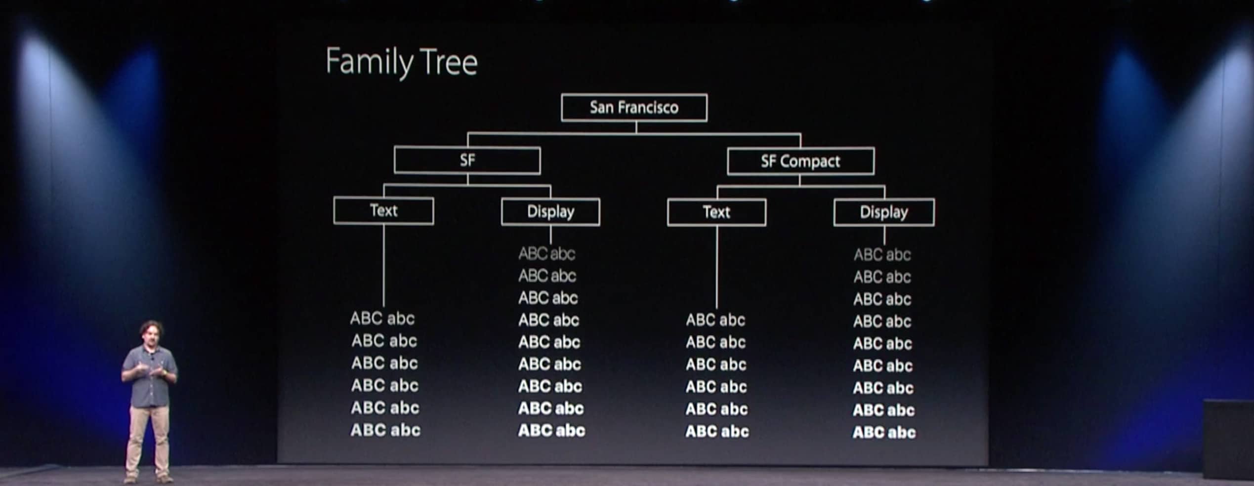
There are two families (SF and SF Compact) meant for iOS / OS X and for the Apple Watch. Each has a display and a text version, with numerous weights.
If you add them up, Apple has drawn no fewer than 60 type styles/weights. In, like, a ton of languages. Not bad.
The differences between SF and SF Compact are interesting. The shapes of the letters in Compact are much more straight, where as SF resembles Helvetica much more closely, with more rounded curves.

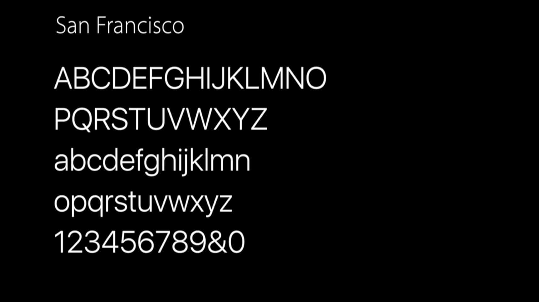
The typeface is 100% compatible with the metrics of Helvetica Neue, the system font used for the last few years, so apps can use the new typeface with no code changes.
The # character is technically called an “octothorpe.”

Visual perception is largely about illusion. A good reminder. The example given was that if you place a circle and square side by side, the circle appears smaller visually. So it has to “overshoot” the line the square is aligned to.
There is a “tracking table” that the typeface automatically uses in apps (and that designers can draw from) for all sizes of the type, to indicate proper letter spacing for legibility at all sizes.
![]()
The word “hamburgefonstiv” doesn’t mean anything, it’s just what typographers use to check the legibility of their typeface.
There are two optical, size-specific families in each typeface: Display and Text, for headlines and for body copy.
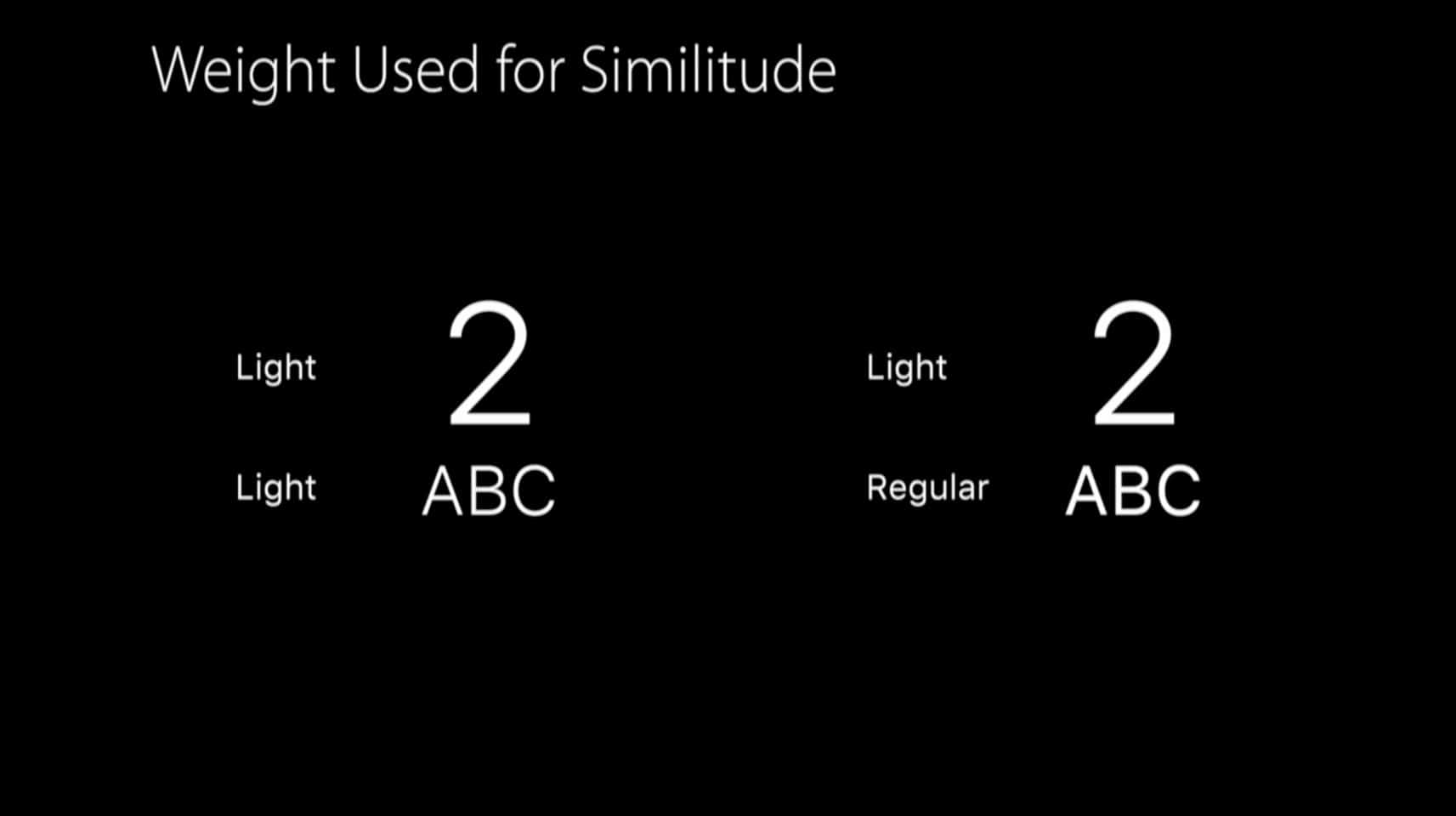
You would use different font weights for differentiation/hierarchy, for similitude, and voice (style). I’ve always found similitude the toughest to describe but the most important in my work.
San Francisco has crazy features to let you create arbitrary fractions that look rad.
It has unique forms, like the uppercase + and the vertically centered :, which you probably wouldn’t even notice if you weren’t looking for it.
You can choose between monospaced numbers and proportional numbers, kind of like how you can choose between uppercase and lowercase numbers in some other typefaces.
San Francisco is a lovely family of type. I’ve been using it myself on beta builds of the new operating systems, and it is delightful!